Rebranding and UX/UI Redesign for Oxford College

The Oxford College rebranding by Dinx Studio focused on building a modern, user-centered digital experience that strengthens the institution’s online presence and brand identity. Guided by in-depth UX/UI research, we mapped student journeys to refine navigation and program discovery. Interactive wireframes and prototypes streamlined the user flow, driving stronger engagement and lead generation.

The result is a responsive and engaging digital ecosystem that not only strengthens Oxford College’s credibility but also inspires learners to take the next step toward a better academic and professional future.


Scope of project:

Brand Strategy – Brand Community Strategy – E-commerce Web Design – Research – UX/UI – Branding and Identity Design – Identity System Design – Digital Marketing Assets – Video Production

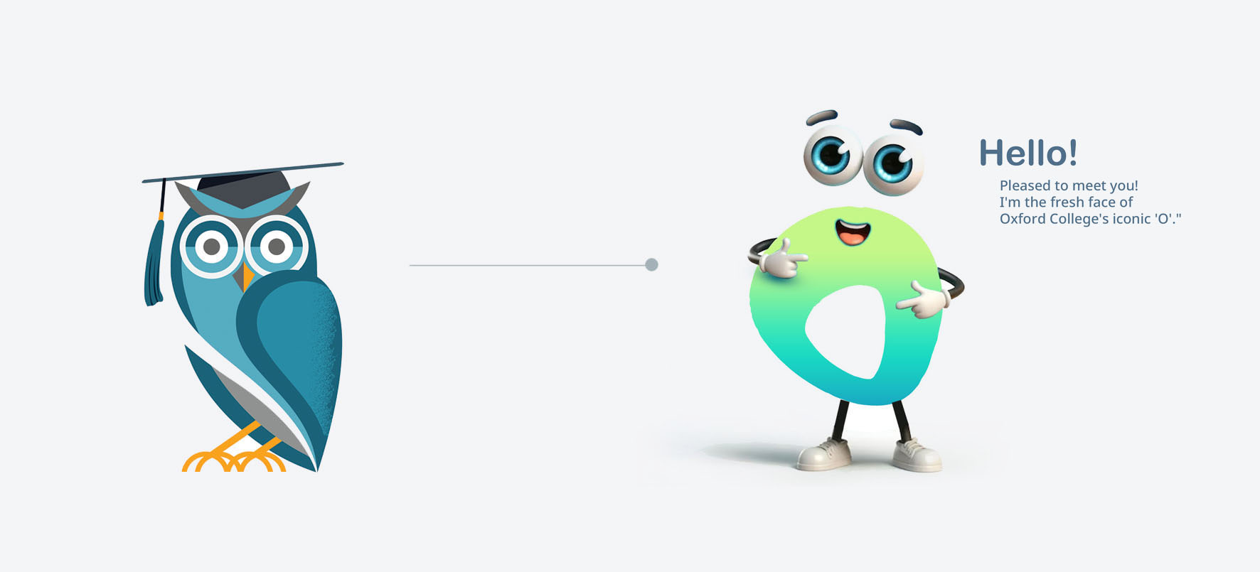


Image 1
Image 2

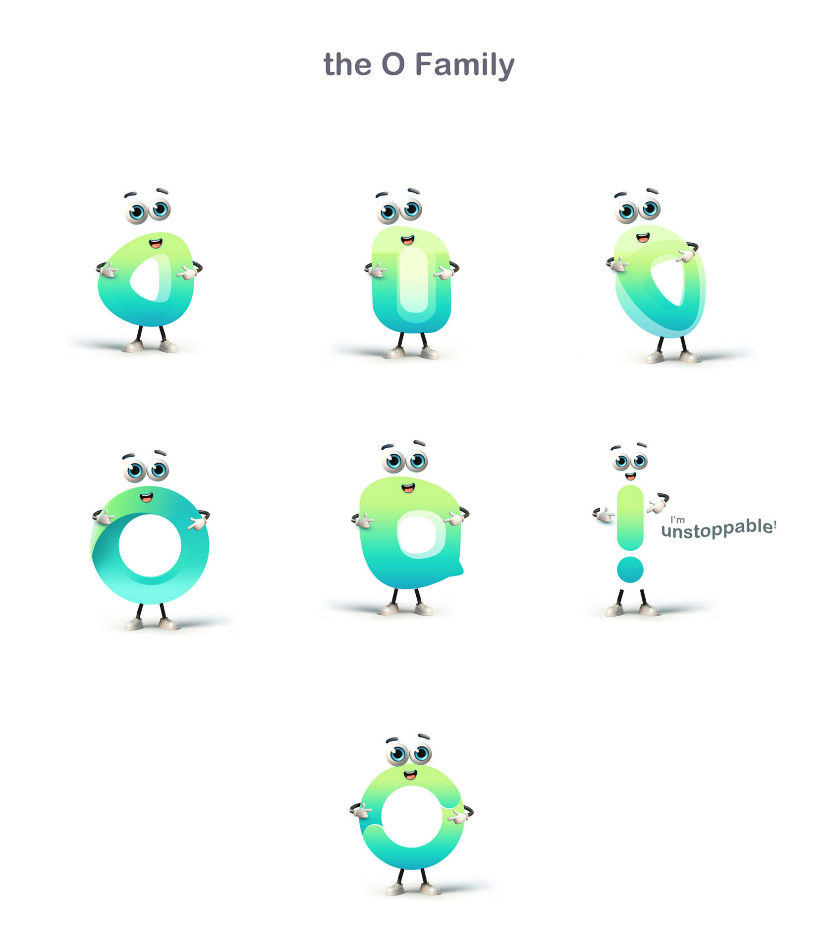
Evolving the Mascot into a Modern Symbol

The Oxford College mascot underwent a creative transformation to reflect energy, pride, and inclusivity. The redesigned emblem features simplified forms, dynamic lines, and contemporary detailing for better adaptability across digital and print mediums. This evolution preserves the mascot’s heritage while positioning it as a vibrant, unifying icon for students, staff, and alumni. It now stands as a modern symbol of school spirit and forward momentum.

Image 2

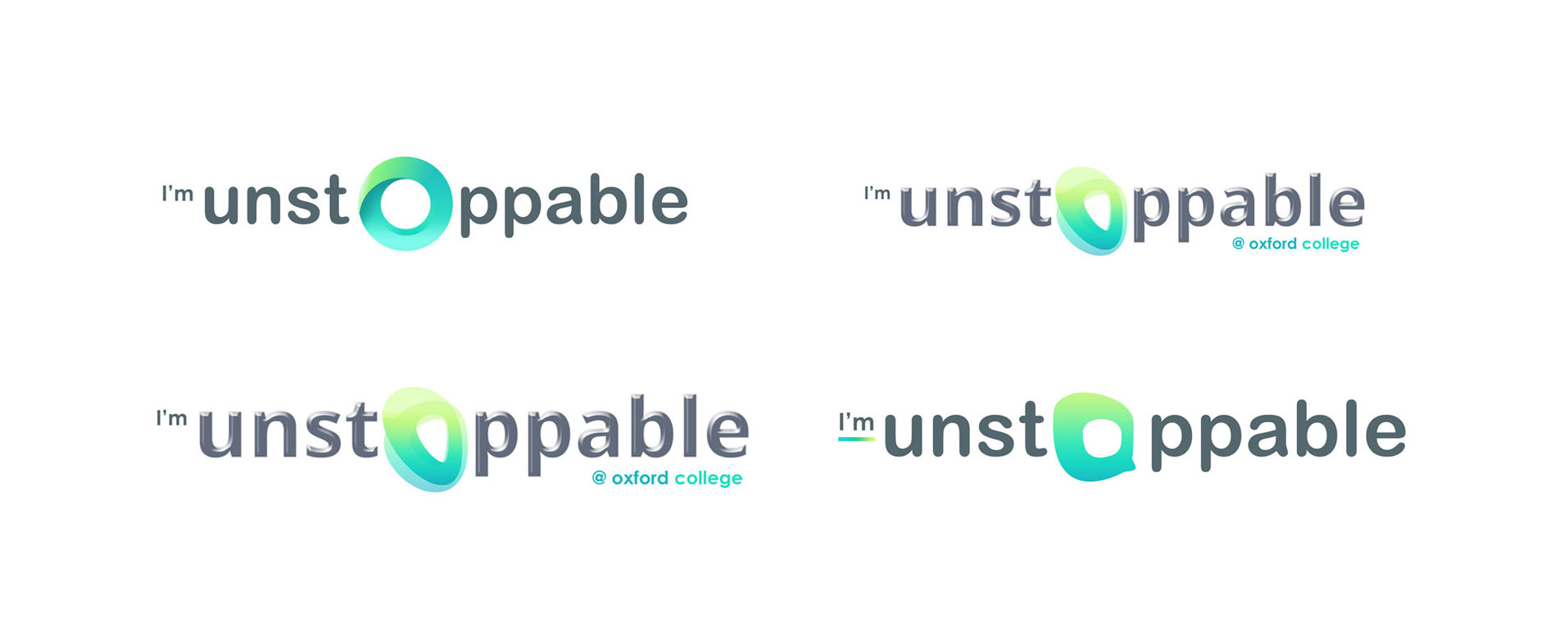
Revitalizing the Oxford College Logo

The Oxford College logo was reimagined to capture the institution’s renewed vision of growth, innovation, and academic excellence. The updated design integrates modern typography, refined geometry, and a balanced color palette that enhances recognition and visual harmony. By blending tradition with a forward-looking aesthetic, the new identity symbolizes progress while honoring the college’s legacy. The result is a timeless, confident mark that embodies trust and leadership in education.

Image 3

Unified Identity: The Logo and Slogan Merger

The integration of Oxford College’s new logo with its slogan created a unified brand identity that communicates purpose and progress at a glance. The visual and verbal elements were aligned to reinforce the college’s mission—empowering students through quality education and innovation. Careful attention was given to balance, spacing, and legibility, ensuring harmony across all brand applications. The result is a cohesive emblem that strengthens recognition and conveys a confident, future-focused message.

Image 4

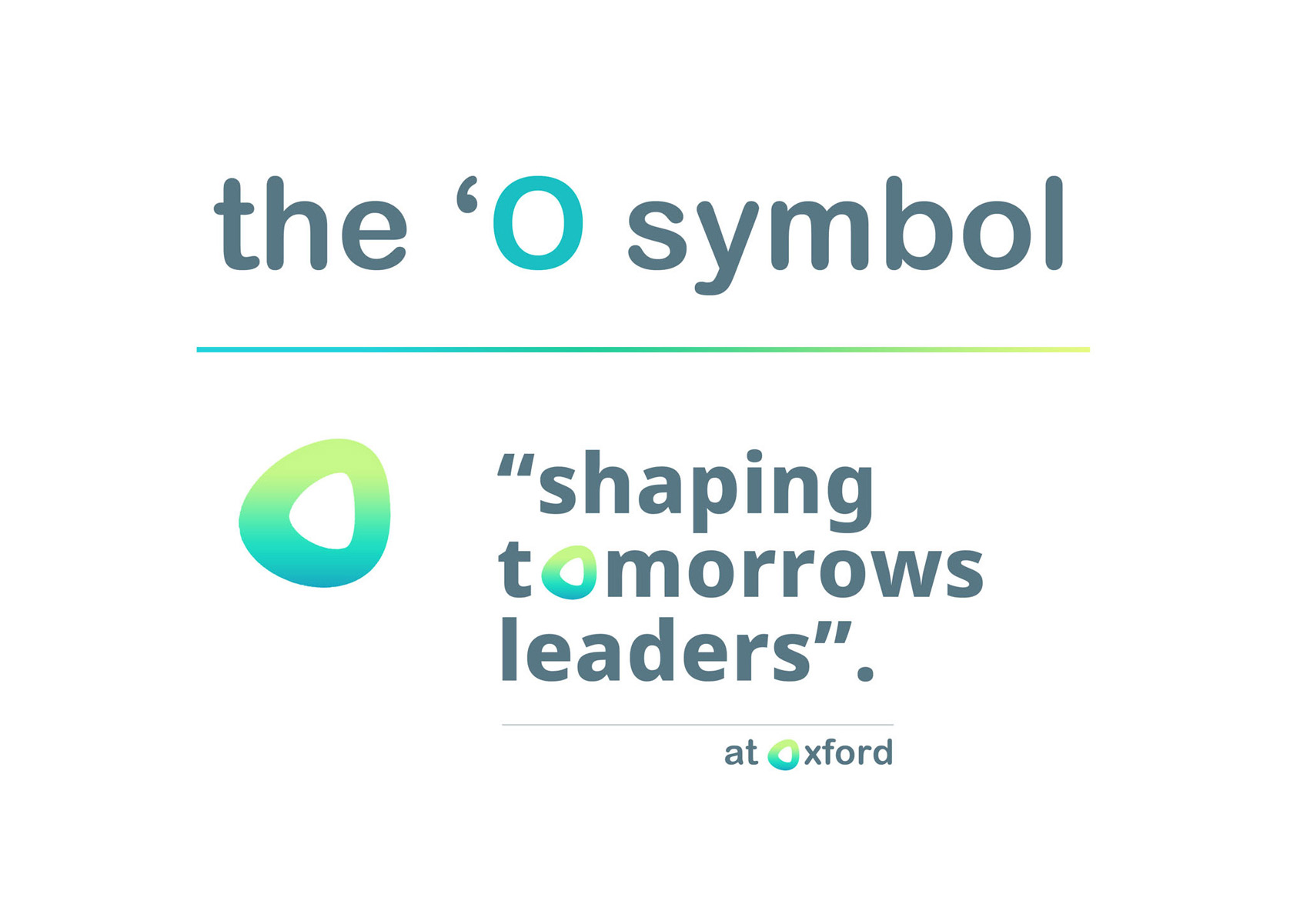
The New Fusion of the “O” Symbol and Slogan

The redesigned “O” symbol was seamlessly blended with Oxford College’s new slogan to create a unified and meaningful visual identity. The circular form symbolizes opportunity, openness, and ongoing growth—core values that define the institution’s mission. Paired with the slogan, it reinforces a message of empowerment and academic excellence. This fusion not only modernizes the brand’s appearance but also establishes a lasting emblem of progress and purpose.


Image 1

The Logo and Brand Identity System

The Oxford College logo serves as the cornerstone of its renewed brand identity, representing both heritage and modern ambition. Built on a clean, contemporary grid, the design extends across all brand applications—from stationery and signage to digital platforms—with clarity and consistency. Complemented by a cohesive color palette and refined typography, the branding system communicates trust, excellence, and accessibility. Together, the logo and visual language create a unified identity that resonates with students and reflects the college’s forward-looking vision.

Image 1

The Reveal of the Letter “O” and Its Application

The letter “O” was unveiled as the defining visual element of Oxford College’s rebrand, symbolizing opportunity, openness, and ongoing learning. Its circular geometry became a flexible design motif used throughout digital and print materials to create visual cohesion and brand recall. Whether applied subtly as a background accent or boldly in hero graphics, the “O” reinforces the college’s identity with modern simplicity and purpose. This adaptable symbol now stands as a powerful representation of Oxford College’s enduring commitment to growth and innovation.

Image 1

Signage, Media, and Marketing Campaigns

The rebranding extended beyond digital design into impactful physical and promotional applications. Custom signage, media assets, and marketing campaigns were developed to create a consistent and recognizable presence across all touchpoints. Each execution—from campus banners and wayfinding systems to social media visuals and digital ads—reflected the new brand language with precision and clarity. This integrated approach strengthened visibility, built trust, and positioned Oxford College as a forward-thinking institution committed to student success.

Image 1
Image 1

Banner and Poster Design

A series of banners and posters were created to visually communicate Oxford College’s renewed identity and academic offerings. Each design emphasized clarity, bold typography, and dynamic imagery to capture attention in both on-campus and digital environments. The layouts were structured around the new color palette and logo system, ensuring brand consistency across all materials. These visuals not only enhanced visibility but also conveyed a strong message of progress, opportunity, and excellence.


Image 1

The Use of the “O” Symbol from Oxford

The “O” symbol became the central design element of Oxford College’s rebrand, representing unity, opportunity, and continuity in education. Its clean geometry and circular form were creatively adapted across multiple touchpoints, including marketing materials, digital interfaces, and campus signage. Used as both a standalone icon and a subtle background motif, it adds depth and cohesion to the overall visual system. This consistent yet versatile application reinforces brand recognition and embodies the spirit of openness and progress that defines Oxford College.

Image 1

Website and Student Learning Portal Custom Headers

Custom headers were designed for both the Oxford College website and student learning portal to create a cohesive and engaging digital experience. Each header integrates the new branding elements, including the refined color palette, typography, and “O” symbol, ensuring visual harmony across all pages. The layouts were optimized for clarity, accessibility, and responsiveness, guiding users seamlessly through information and course navigation. This unified header system enhances usability while strengthening the brand’s professional and academic identity online.

Image 1

Alternate Design Explorations for the “O” Symbol

Multiple design variations of the “O” symbol were explored to capture different aspects of Oxford College’s identity—growth, inclusivity, and innovation. Each option experimented with gradients, dimensional depth, and geometric balance to test versatility across digital and print applications. These explorations allowed the brand to evaluate how the symbol performs in motion graphics, social media, and large-format signage. The final selection achieved the ideal balance of simplicity and distinction, ensuring the “O” remains timeless and adaptable across all brand touchpoints.

Image 1

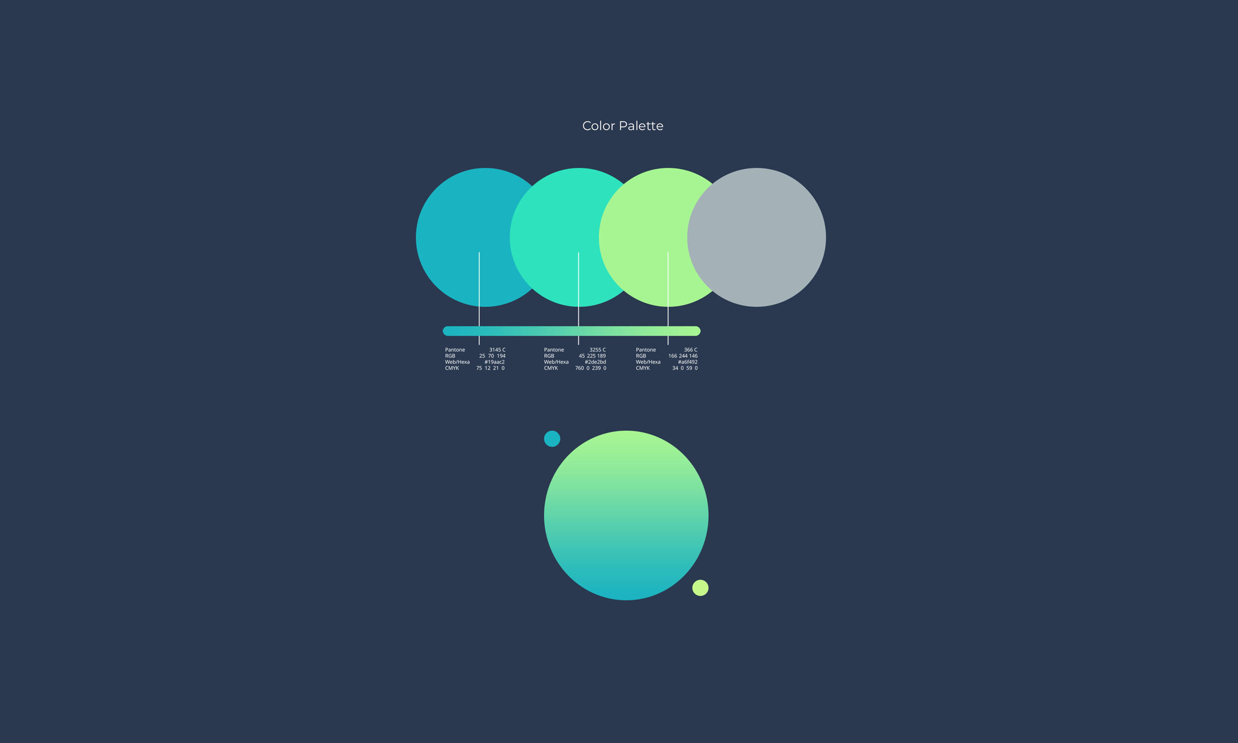
The Usage and Presentation of Brand Colors

The Oxford College color palette was carefully curated to reflect professionalism, trust, and forward momentum. Primary tones were chosen to convey stability and academic excellence, while secondary accents introduced vibrancy and energy to the overall design system. Each color was strategically applied across digital, print, and environmental media to maintain consistency and visual harmony. This thoughtful use of color strengthens brand recognition and creates an engaging, cohesive experience across all communication platforms.

Image 1

Icon Presentation of the “O”

The “O” icon was refined into a standalone emblem that embodies the essence of Oxford College’s renewed identity. Designed with precision and symmetry, it functions as a versatile brand mark adaptable for app icons, social profiles, and digital interfaces. Its clean lines and balanced form ensure instant recognition even at smaller scales, while maintaining consistency with the primary logo. This minimalist icon presentation reinforces the brand’s modern aesthetic and extends its presence across both digital and physical environments.

Image 1

The “O” Icon in Digital Applications

The “O” icon was optimized for use across all digital platforms, ensuring brand consistency in every user interaction. It serves as the favicon for the website, the profile image for social media channels, and the app icon for mobile and learning platforms. Each version was carefully adjusted for scale, contrast, and clarity to maintain visual precision across various screen sizes and devices. This seamless integration strengthens Oxford College’s digital presence and reinforces brand recognition across all online environments.


Image 1

Color Theory and Visual Harmony

The color system for Oxford College was developed using principles of contrast, balance, and emotional resonance. Primary hues were selected to convey trust, intelligence, and academic integrity, while secondary tones introduced vibrancy and warmth to support engagement. Each color combination was tested for accessibility and digital performance to ensure clarity across all mediums. The resulting palette delivers both aesthetic appeal and functional harmony, reinforcing the college’s identity as modern, credible, and student-focused.


Image 1
Image 1
Image 1
Looking for a branding partner?