Mecharm Group: Building Strong Foundations for the Future

Mecharm Group, a commercial and industrial construction company, approached Dinx Studio to rebuild its brand identity. Their projects reflected excellence, but the visuals lacked direction and failed to capture the trust and innovation behind their work. Through focused UX and UI research, we identified gaps in color, typography, and digital presentation that weakened their overall impact. Our goal was to create a design system that felt strong, modern, and consistent across all platforms. We introduced a structured logo, a refined neutral palette, and clear typography inspired by architectural precision.

The result is a cohesive and credible identity that positions Mecharm Group as a trusted builder of spaces and enduring value.


Scope of Project:

Brand Strategy – Brand Community Strategy – Web Design and Development – UX/UI – Branding and Identity Design – Identity System Design – Digital Marketing Assets – Video Production

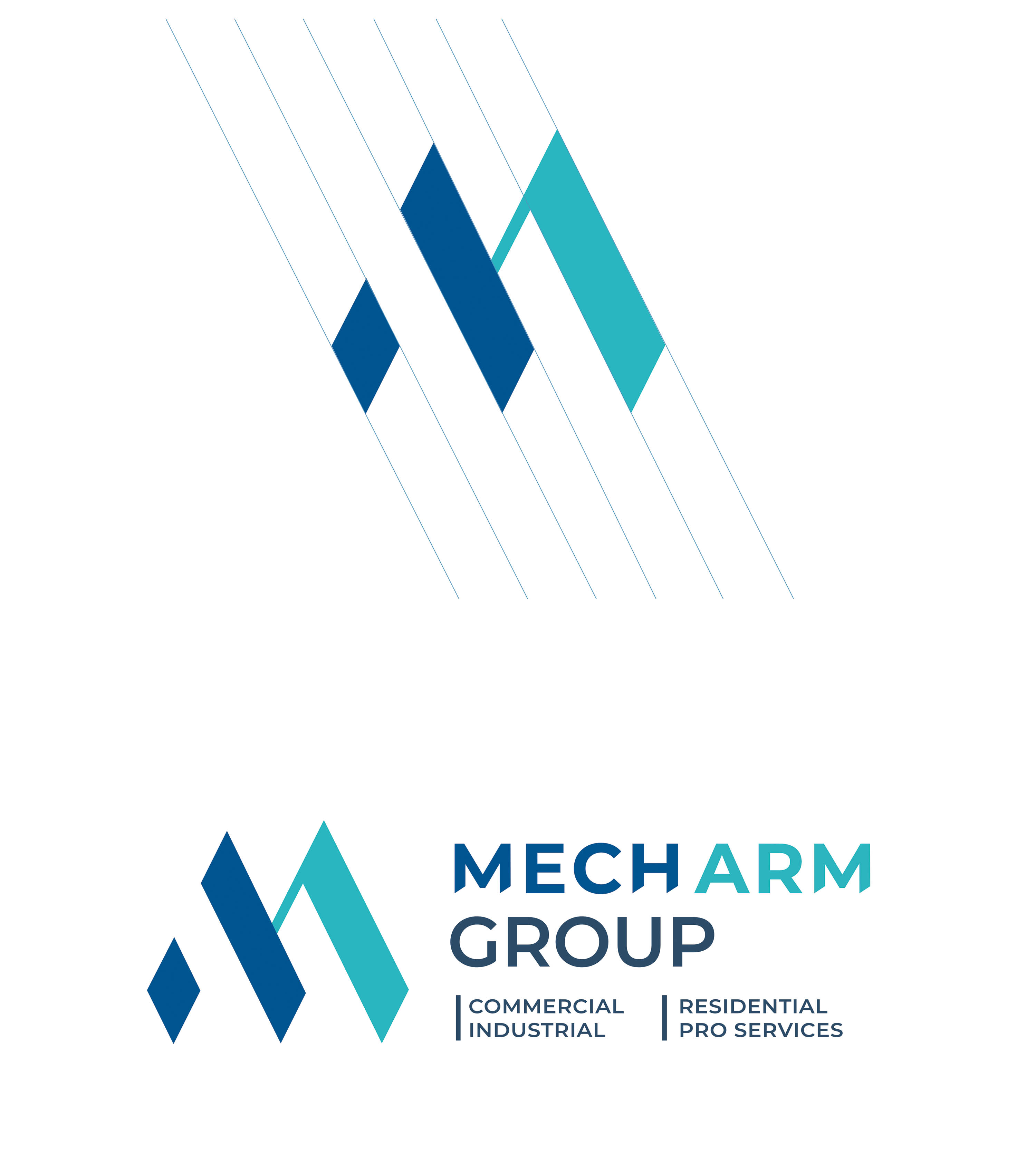
Image 1

Unveiling the Mark: A Symbol of Strength and Precision

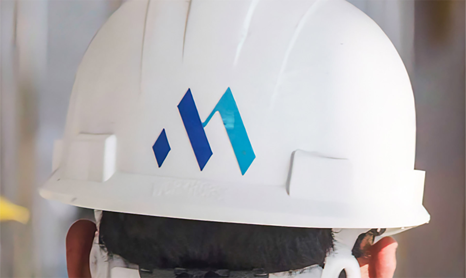
Every great brand begins with a story — and for Mecharm Group, that story is one of resilience, progress, and purpose. The logo was envisioned as a reflection of the company’s unwavering dedication to engineering excellence and community advancement. Drawing inspiration from architectural geometry and structural balance, the mark embodies strength and direction — two elements that define Mecharm’s presence in the commercial and industrial construction landscape. The bold, interlocking forms signify unity and precision, while the color palette of deep blue and aqua conveys trust, innovation, and forward momentum. More than just a visual symbol, the Mecharm Group logo represents the fusion of craftsmanship and vision. It stands as a proud emblem of a company building not only durable structures but a stronger foundation for generations to come.

Image 2

Animated Logo and Branded Motion for Email Signature

The Mecharm Group logo animation was designed to bring the brand to life across digital touchpoints, including email signatures and presentations. The sequence mirrors the brand’s architectural precision, where each element builds upward in harmony—symbolizing growth, innovation, and structural integrity.


Image 2

Project Showcase Video Production

A dynamic brand film was produced to highlight Mecharm Group’s diverse construction portfolio. The video combines aerial visuals, project footage, and motion graphics to communicate expertise, scale, and craftsmanship, presenting the company as a leader in commercial and industrial development.


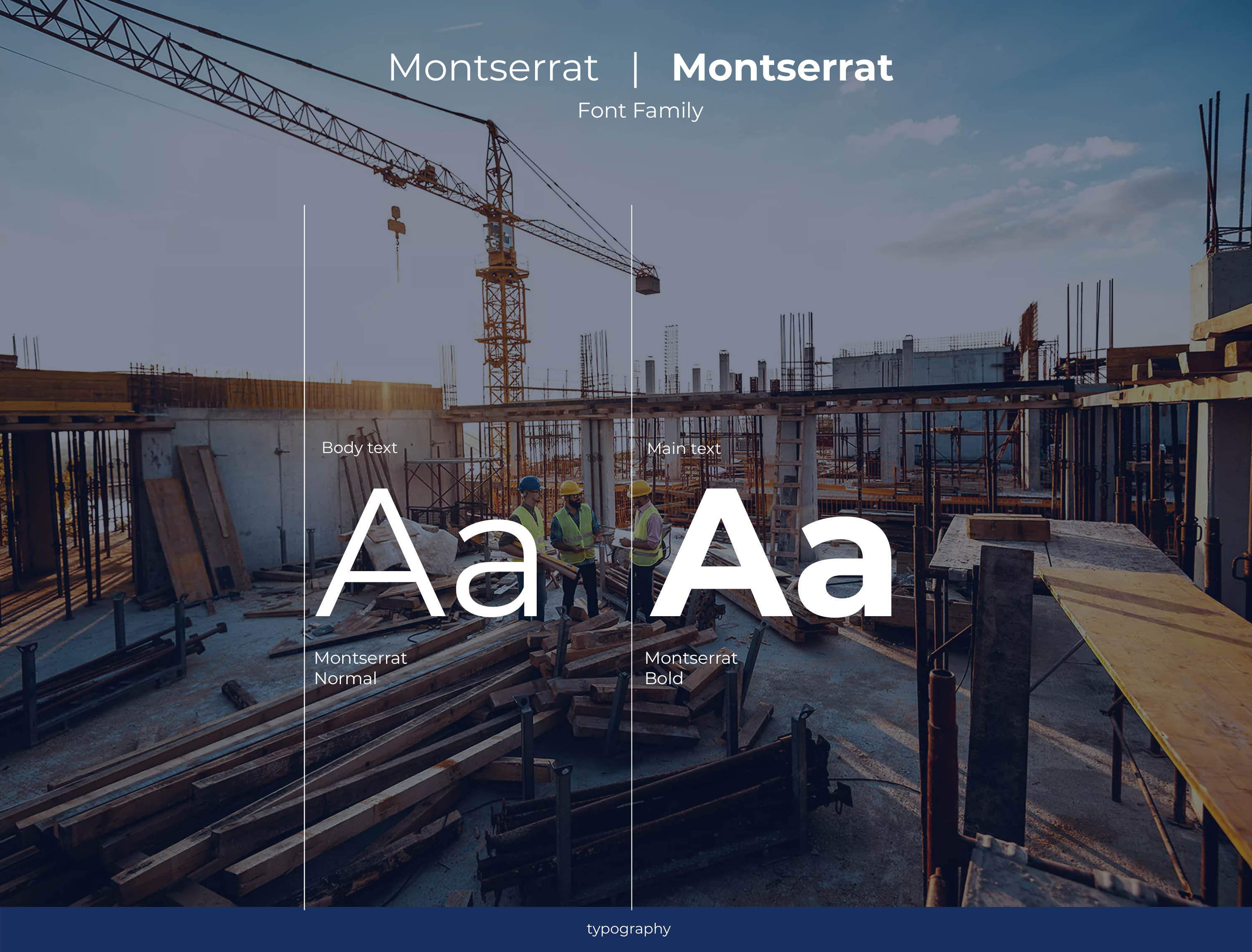
Typography System

The typography was selected to balance authority and approachability. Clean, geometric sans-serif fonts create a professional foundation while maintaining legibility across print and digital mediums, reinforcing Mecharm Group’s commitment to clarity and excellence.

Image 3

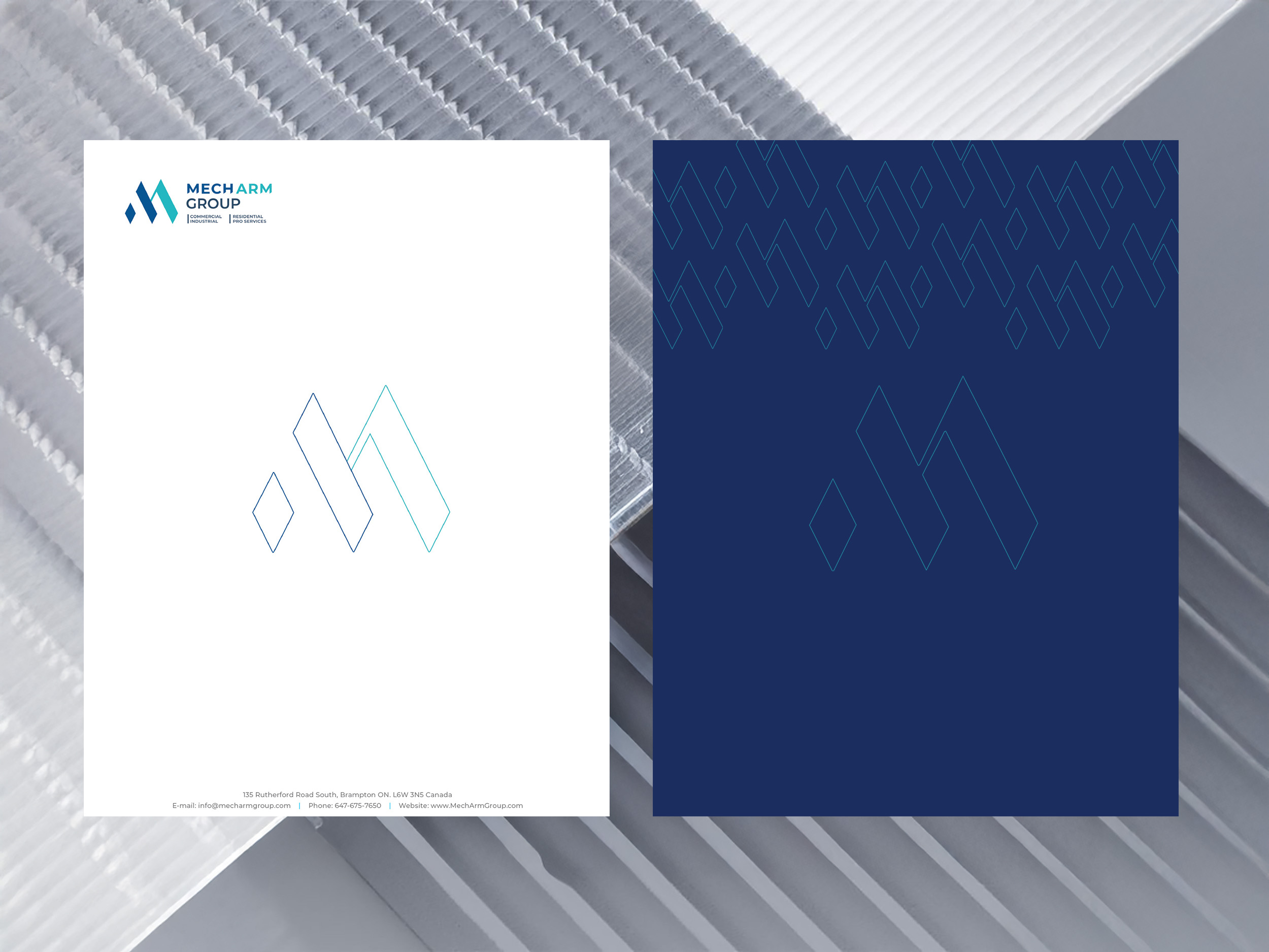
Color Palette, Business Card, and Stationery Design

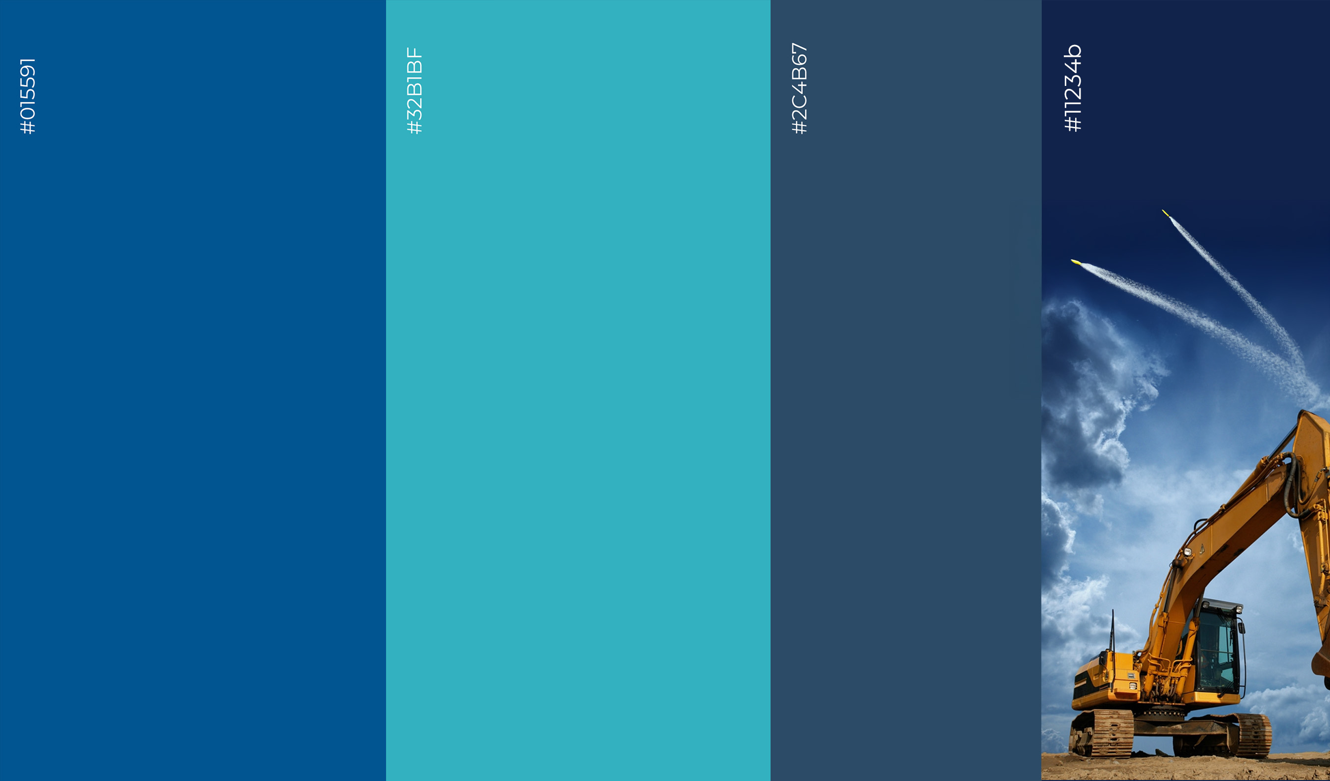
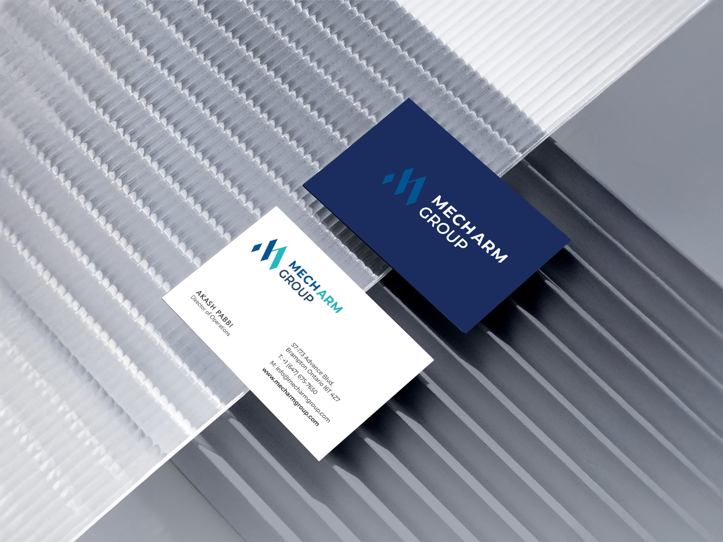
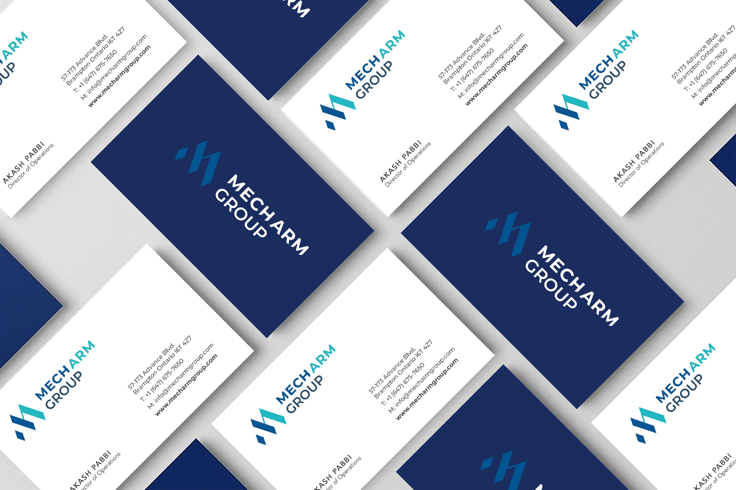
Rooted in a palette of deep blue and aqua tones, the color system embodies trust, reliability, and forward-thinking innovation. The visual language reflects a sense of confidence and clarity, aligning seamlessly with the brand’s professional essence. Business cards and stationery were meticulously crafted with minimalist compositions, embossed detailing, and premium paper stocks, creating a tactile experience that elevates the brand’s corporate presence. Together, these elements deliver a cohesive, modern, and sophisticated identity that communicates both stability and progress.


Image 1
Image 1
Image 1

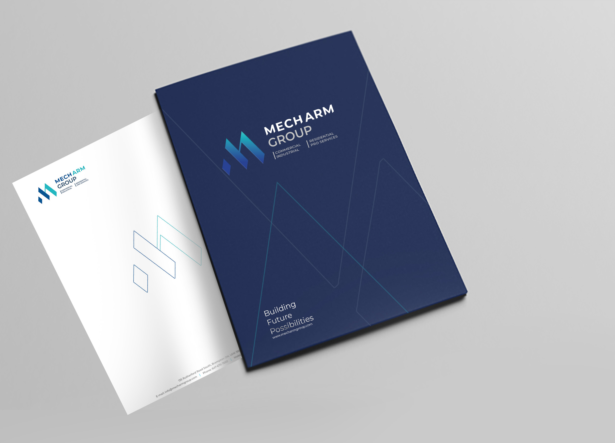
Corporate Collateral and Promotional Materials

Complementary materials—including presentation folders, letterheads, and envelopes—extend the brand’s visual consistency. Each piece reflects Mecharm’s refined aesthetic, ensuring every client interaction communicates professionalism and precision.

Image 1
Image 1

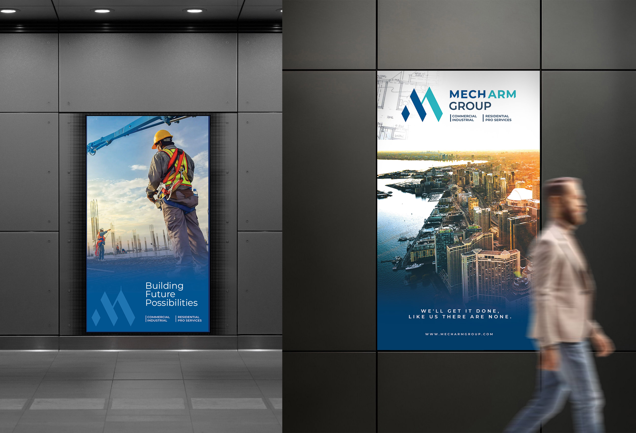
Marketing Signage and Environmental Branding

To extend the brand’s visibility beyond digital and print, Dinx Studio designed a cohesive suite of marketing signage for Mecharm Group. From on-site construction hoardings to indoor display panels and directional signs, each piece reinforces the company’s visual identity with precision typography, clean geometry, and impactful color contrast. The result is a unified physical presence that strengthens brand recognition and communicates professionalism across every project site.

Image 1

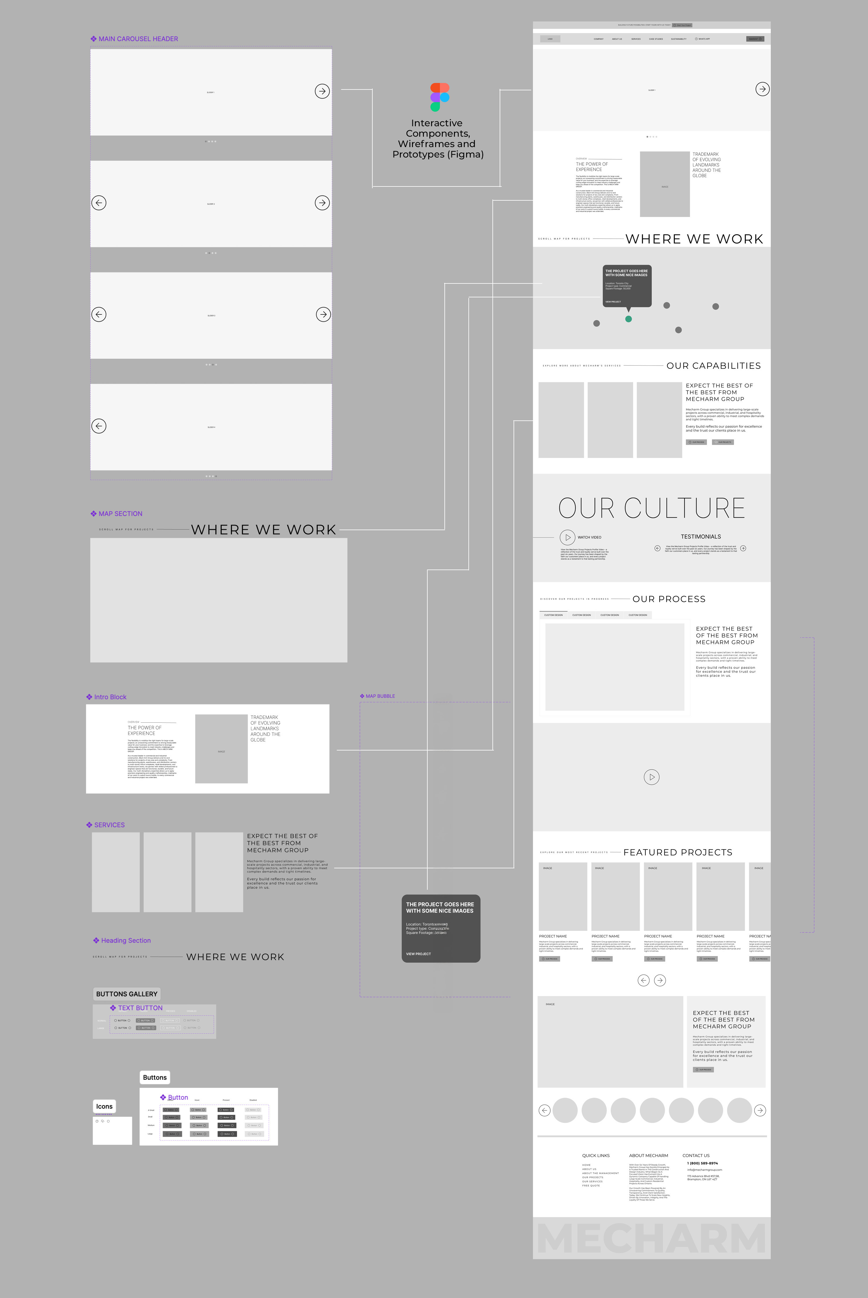
Interactive Prototypes and Low-Fidelity Wireframes

Before entering full development, Dinx Studio crafted low-fidelity wireframes and interactive prototypes to map user journeys and define the site’s structure. This early-stage visualization allowed the Mecharm team to experience the website’s flow in real time, streamline feedback, and ensure that every interaction and layout decision aligned seamlessly with the project vision.

Image 1

Figma Components and FigJam UX/UI Flow Mapping

The digital design workflow was executed entirely in Figma and FigJam, allowing seamless collaboration between our design and development teams. Modular components, shared libraries, and grid systems provided both structure and scalability—ensuring design consistency across every page and screen size. Using FigJam, user flows and interaction maps were developed to visualize the complete customer journey, aligning strategic goals with functional design. This approach fostered real-time collaboration, accelerated revisions, and maintained design integrity from concept to final implementation. The result was a cohesive, system-driven user experience that balanced aesthetics with performance precision.

Image 1

High-Fidelity Design and Development Transition

Building upon the approved prototypes, Dinx Studio advanced into high-fidelity design—translating strategy and structure into a polished visual experience. Each interface was refined with precise typography, consistent spacing, and a cohesive color system to reflect Mecharm Group’s modern identity. The transition into development was seamless, ensuring that every animation, interaction, and responsive behavior mirrored the original design intent across all digital platforms.

Image 1

Interactive Project Map

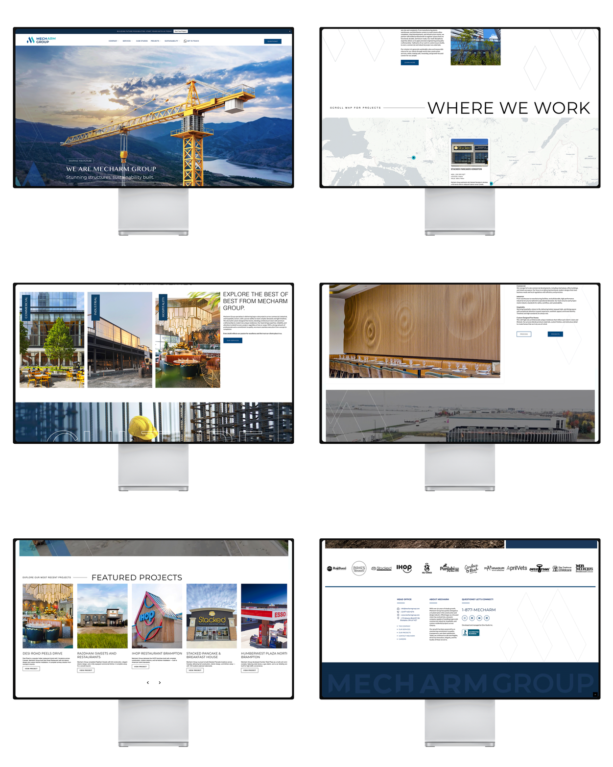
An interactive real-time map was embedded into the website, showcasing Mecharm Group’s project locations across Canada. This feature offers visitors a visual understanding of the company’s national footprint and ongoing expansion.

Responsive Website Experience

The Mecharm Group website was meticulously designed to deliver a seamless user experience across all devices. Every element—from image grids to interactive project maps—was optimized for fluid responsiveness, ensuring consistent performance on desktop, tablet, and mobile. This adaptive design approach allows clients and partners to explore the brand’s projects effortlessly, maintaining visual clarity and functionality at every screen size.

Image 1

Website Design and Project Case Study Development

Dinx Studio created a modern, responsive website that integrates case studies, media galleries, and interactive content. The design reflects Mecharm’s forward-thinking approach while ensuring seamless navigation and an elevated digital presence.

Corporate Profile and Company Brochure

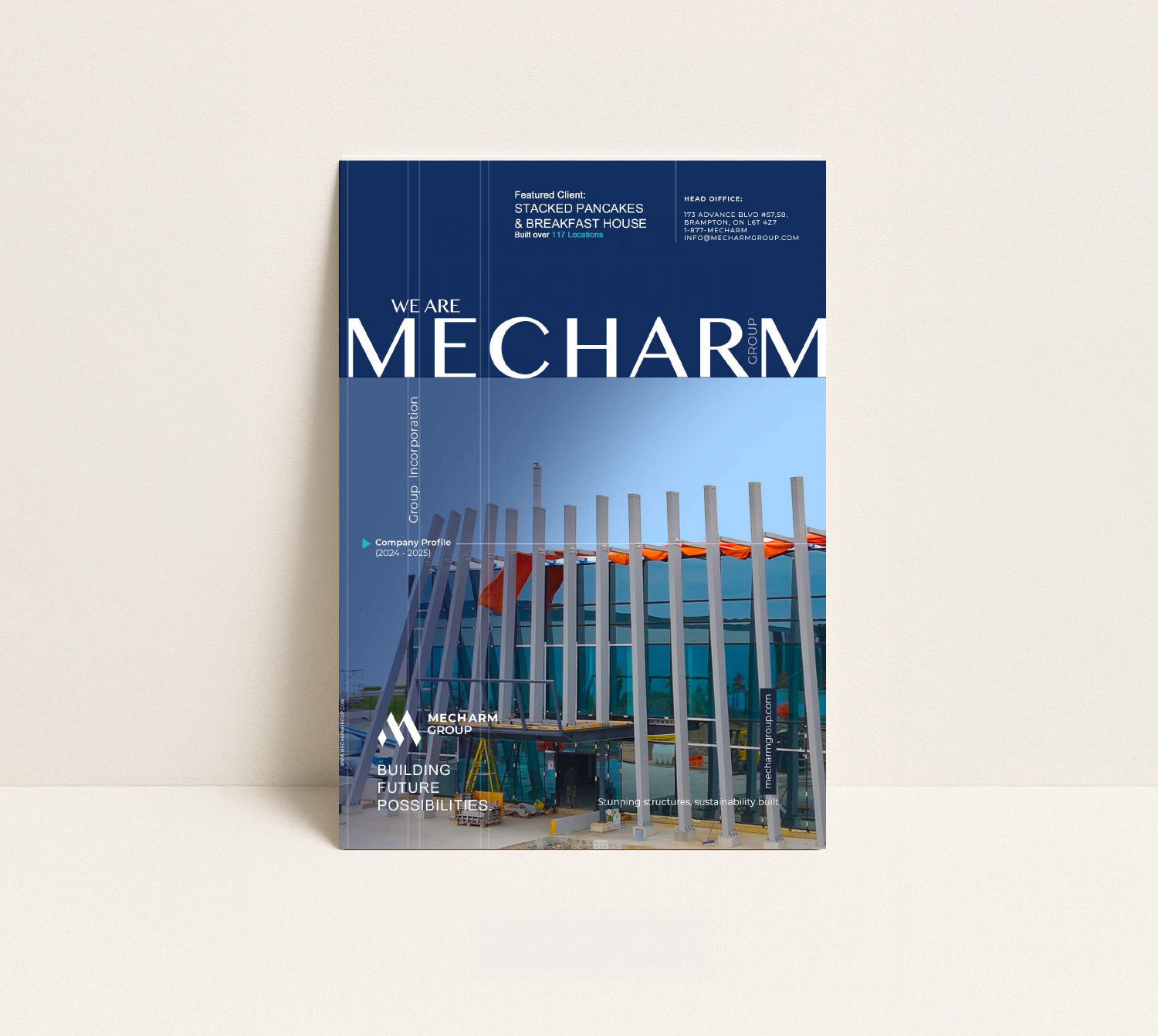
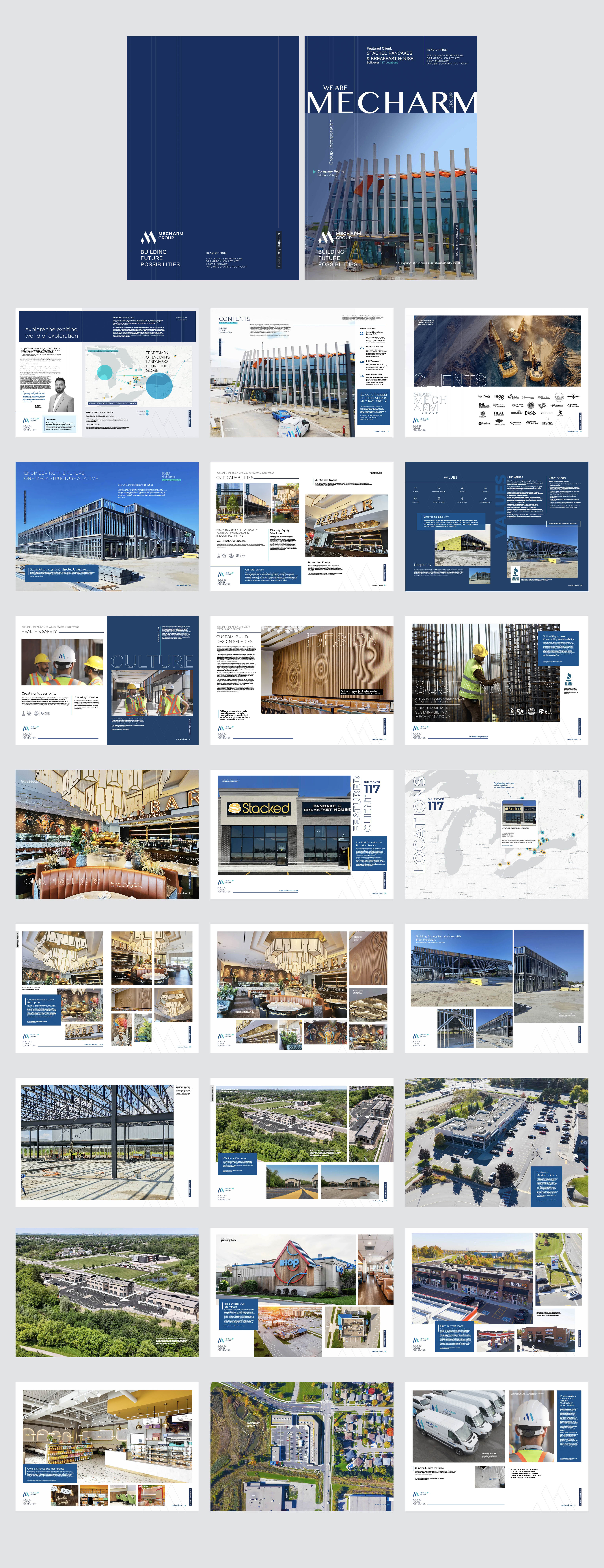
A visually rich company profile brochure was designed to present Mecharm Group’s services, expertise, and achievements. The layout merges architectural imagery with structured content flow, providing an elegant overview for clients and partners.

Image 1
Image 1


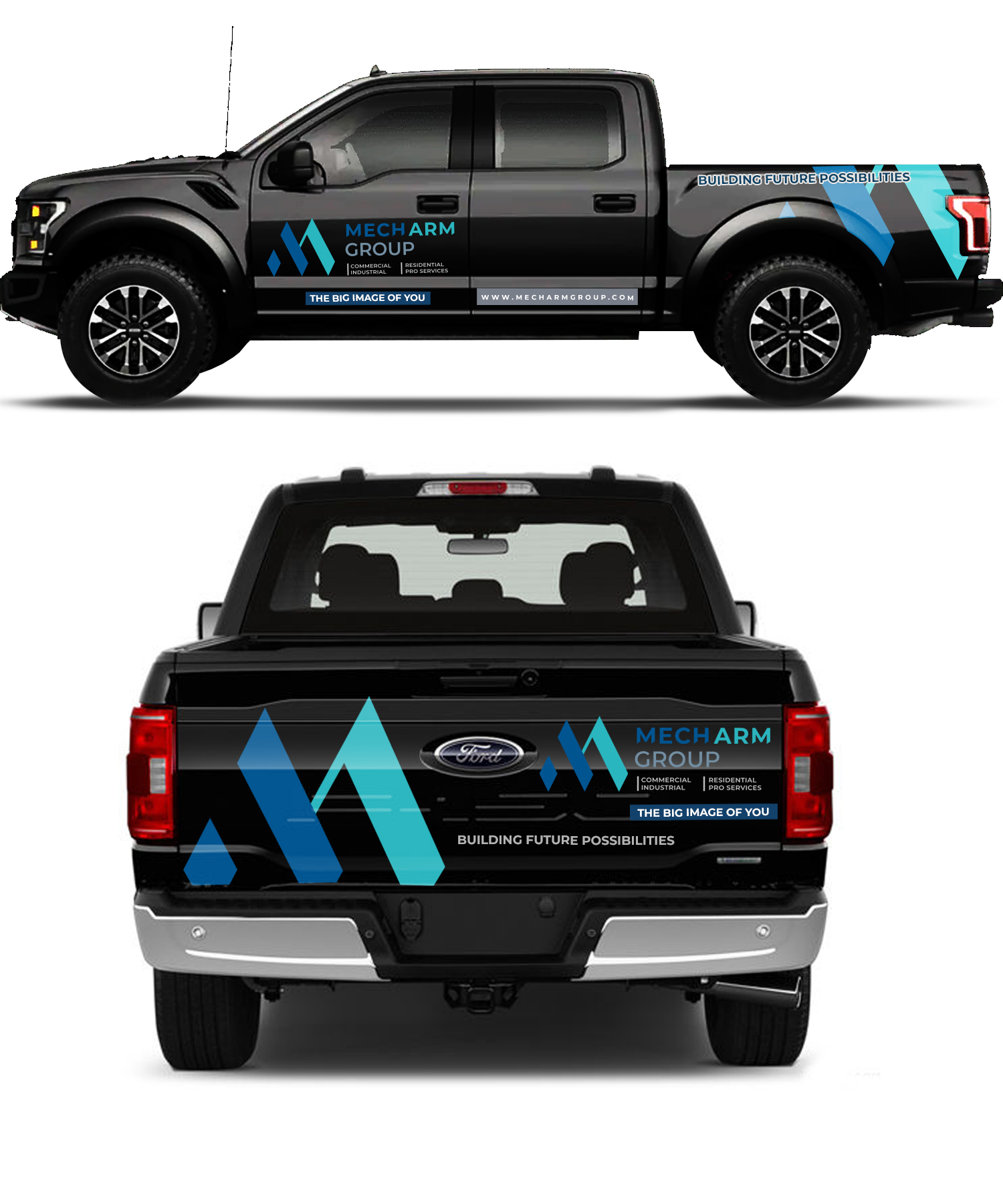
Fleet/Vehicle Wrap Design

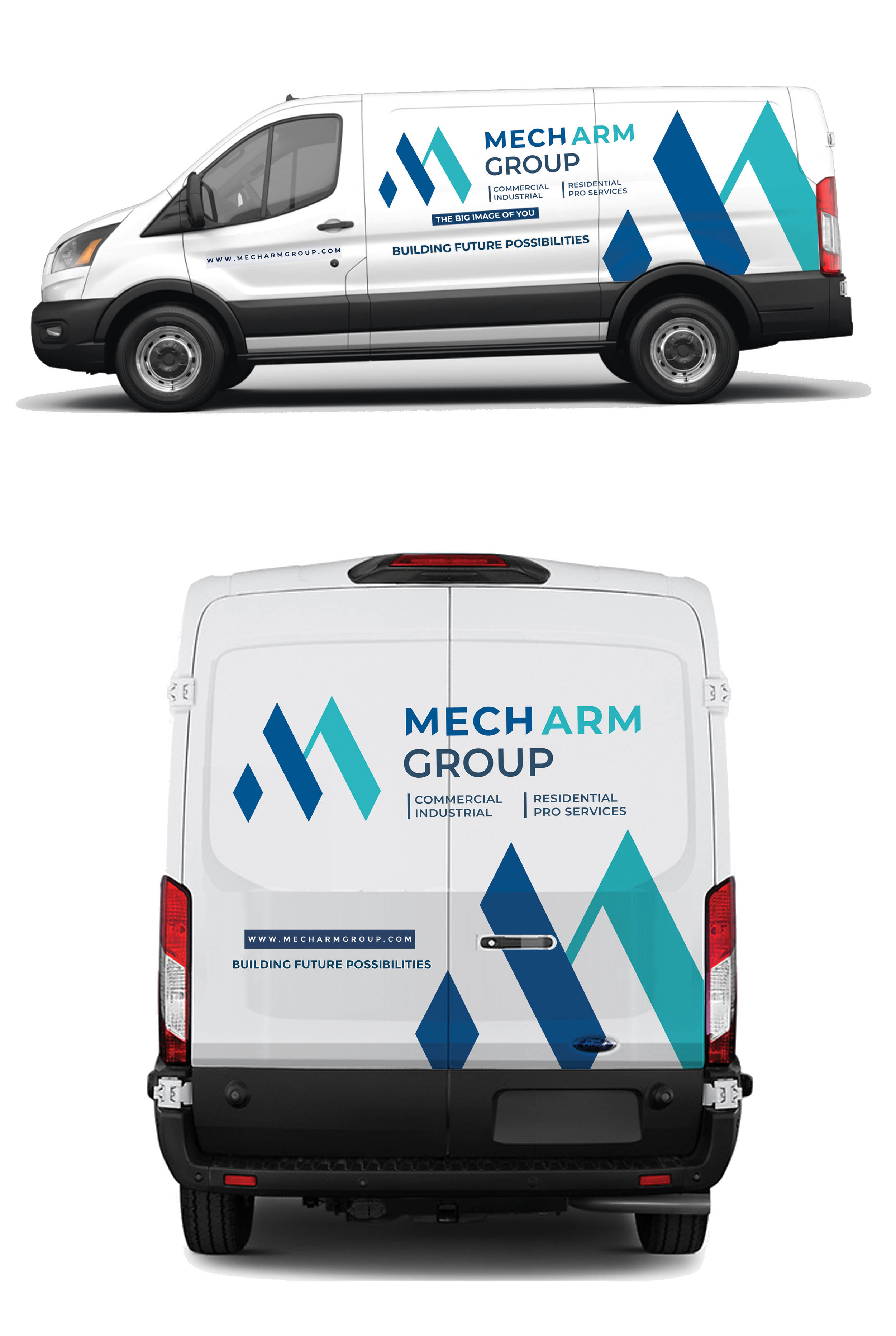
Fleet branding was designed to extend Mecharm’s identity into the physical environment. The clean geometric patterning and bold color application create strong visibility on roads, reinforcing brand awareness in every region served.

Image 1

Printing and Vehicle Wrapping

Our design process for construction site signs and banners prioritizes maximum visibility and effective communication to enhance our clients' reputation. Each sign prominently displays the company's logo, bold typography, and signature colors, reinforcing brand identity while conveying essential project information. We use durable materials to withstand the elements, ensuring a professional appearance throughout the project's duration. These banners not only define the construction site but also highlight Stallion's commitment to quality and precision, effectively promoting the company to passersby and potential clients.

Image 1

Merchandising and Branded Print Materials

A curated line of branded merchandise and print materials—such as apparel, signage, and office accessories—was developed to strengthen internal brand culture and client-facing presence, reflecting the company’s commitment to quality and consistency.

Image 1
Looking for a branding partner?