Jenco Canada: Illuminating with Smart Design

Jenco Canada, a leading LED lighting wholesaler, collaborated with Dinx Studio to modernize its brand and website. Their previous identity lacked visual coherence and failed to showcase their innovation in lighting technology. UX and UI research guided the redesign, focusing on user experience and product discovery. We created a clean interface, modern logo, and bright yet balanced color palette that reflect clarity and technological advancement.

The new identity and website highlight Jenco’s expertise and make navigation effortless for retailers and distributors. Jenco Canada now shines as a modern, forward-thinking brand in the lighting industry.


Scope of project:

Brand Strategy – Brand Community Strategy – E-commerce Web Design – Research – UX/UI – Branding and Identity Design – Identity System Design – Digital Marketing Assets – Print Media – Video Production
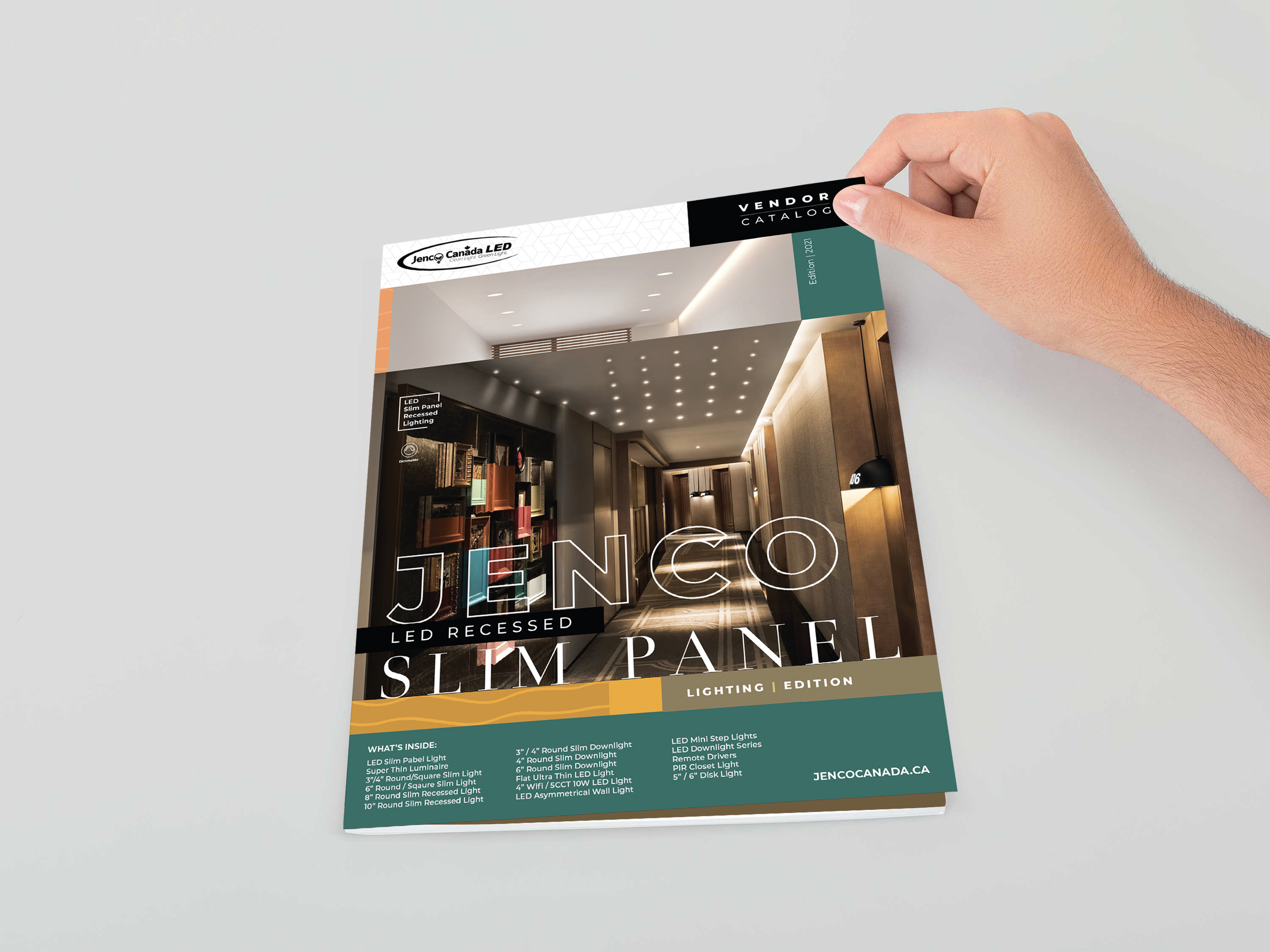
Image 1
Image 2

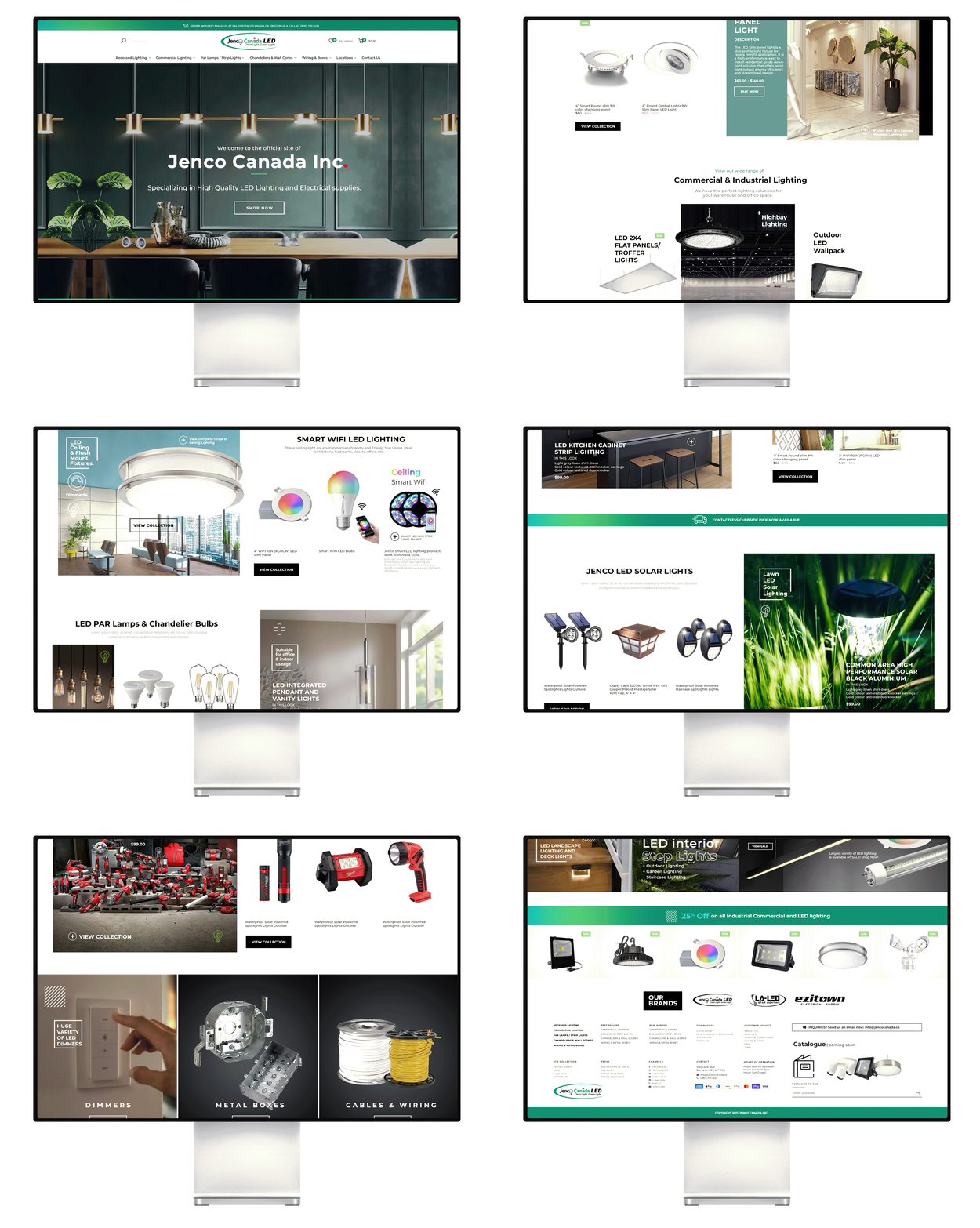
User Experience Strategy and Interface Design for E-commerce

The e-commerce platform was designed around a clear user experience strategy that prioritized intuitive navigation, fast-loading pages, and minimal friction at every step of the shopping journey. A modular interface system ensured visual consistency across all devices while maintaining flexibility for product updates and seasonal campaigns. User flow mapping and wireframing informed every interaction, resulting in a responsive design that feels effortless and engaging. The final interface combines aesthetic clarity with data-driven functionality to enhance conversions and strengthen brand trust.

Image2

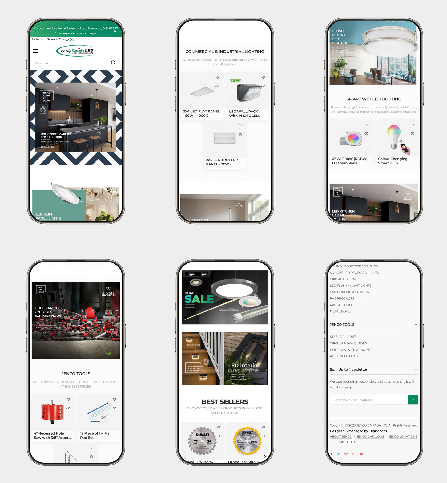
Responsive Design for a Seamless User Experience

The website was built with a responsive design framework that adapts flawlessly to any device, ensuring a consistent and intuitive browsing experience across desktops, tablets, and mobiles. Every layout element, from typography to imagery, was optimized for touch and interaction responsiveness. This adaptability not only enhances usability but also reduces bounce rates by keeping users engaged throughout their journey. The result is a visually balanced, performance-driven interface that delivers accessibility and comfort across all screen sizes.

Image2

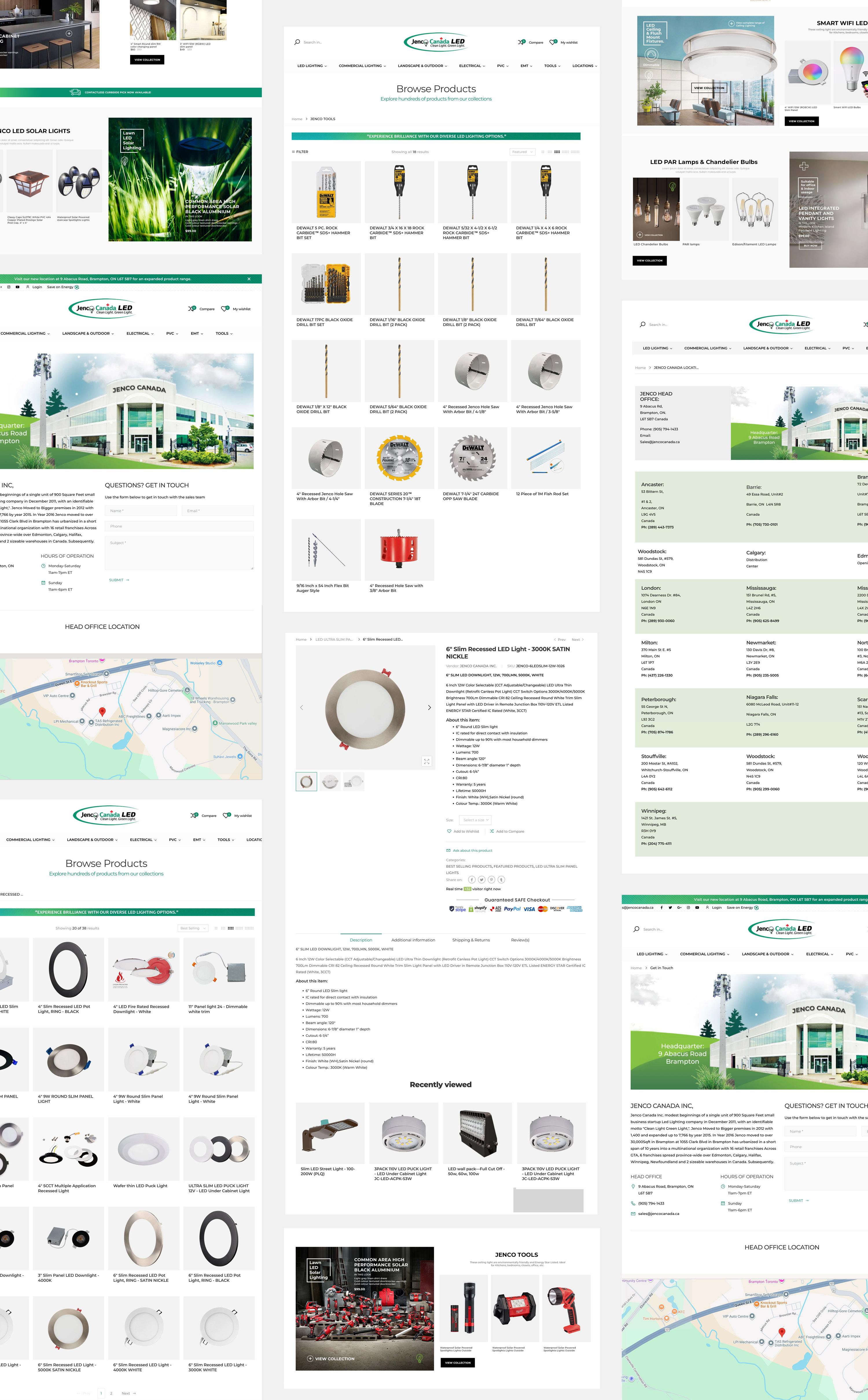
Optimized UX/UI Flow Mapping for the Online Shopping Journey

The user flow was strategically mapped to simplify navigation and guide customers effortlessly from product discovery to checkout. Each interaction was designed to reduce cognitive load, enhance clarity, and create a sense of continuity throughout the shopping experience. By analyzing user behavior patterns, the design prioritized key touchpoints that drive engagement and conversion. The result is a well-structured, intuitive flow that transforms browsing into an enjoyable and goal-oriented journey.

Image 1

Intuitive Menu Design with Visual Product Navigation

The menu system was thoughtfully designed to provide users with a visually engaging and intuitive navigation experience. Each menu category features relevant product imagery, allowing users to connect instantly with the items they’re exploring. This visual-driven approach reduces search time and enhances product discoverability. The result is a creative, user-friendly menu that blends aesthetics with functionality for a smoother shopping journey.

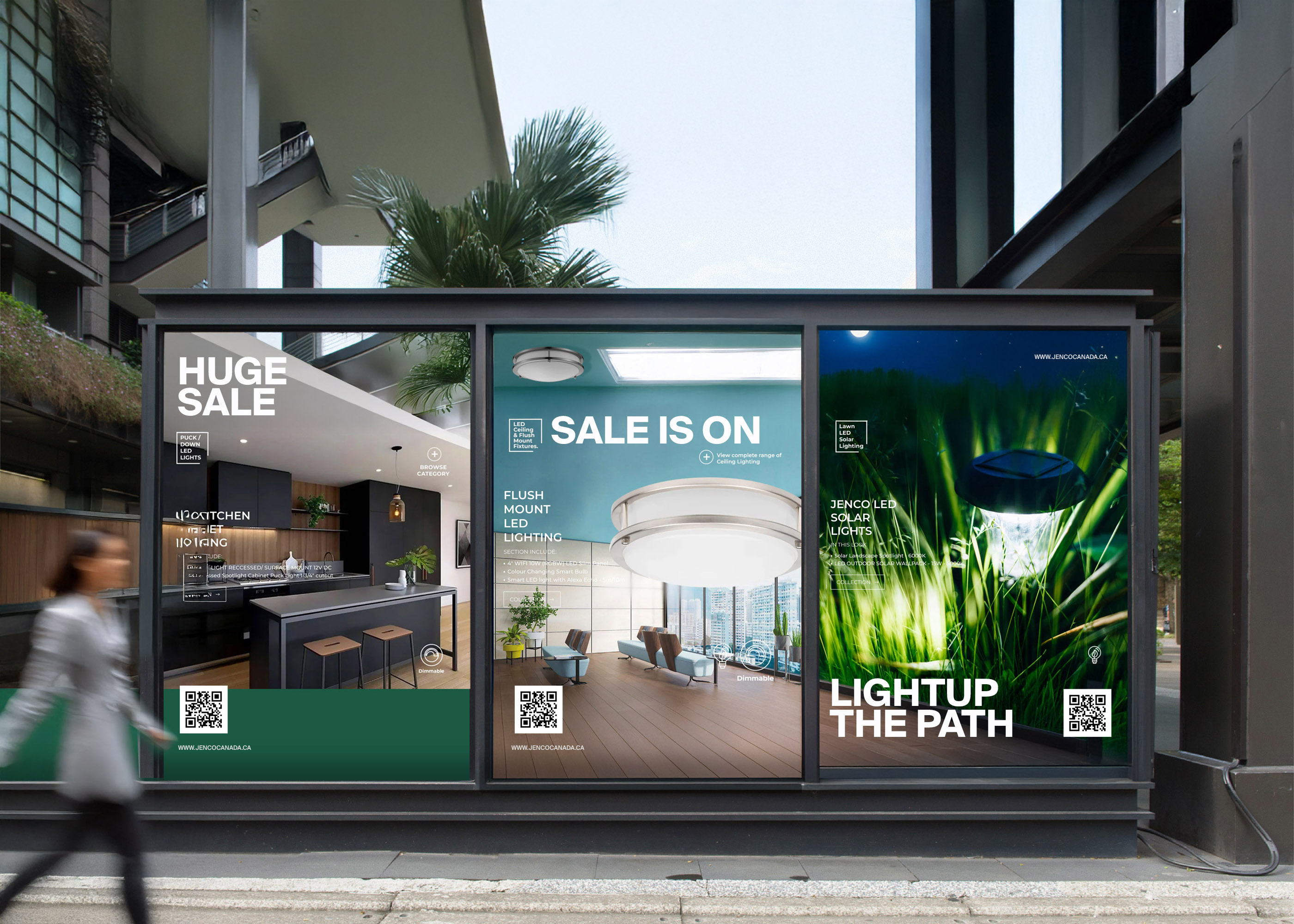
Integrated Signage and Digital Marketing Design

A cohesive visual identity was extended beyond the website into signage and digital marketing assets to ensure consistent brand recognition across all touchpoints. Each piece—from storefront displays to social media creatives—was designed to reinforce the brand’s tone and visual language. Strategic use of typography, color, and imagery maintained continuity while enhancing audience recall. This integration created a unified presence that strengthened both in-store visibility and online engagement.

Image 1

Product Specification Catalogue Design

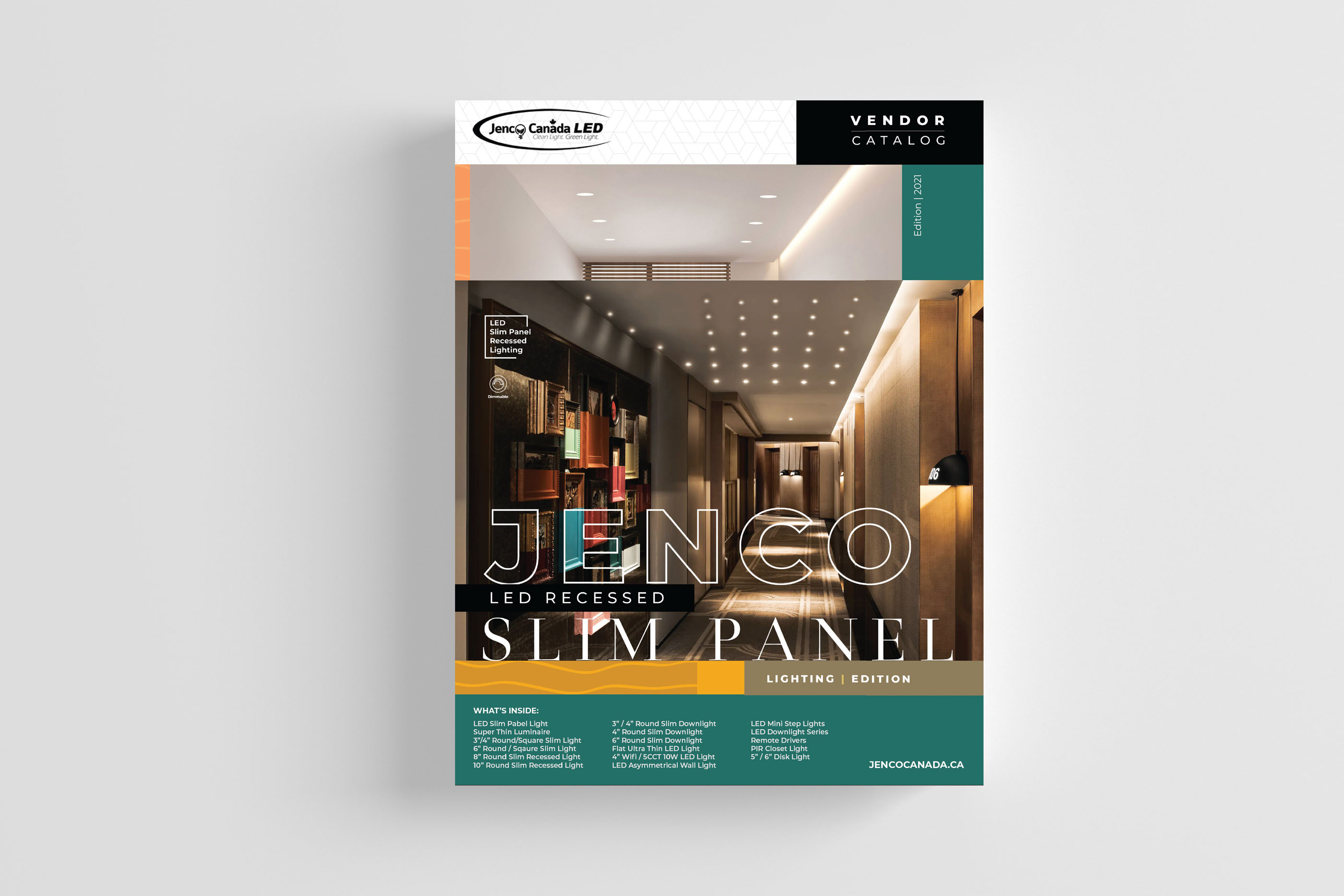
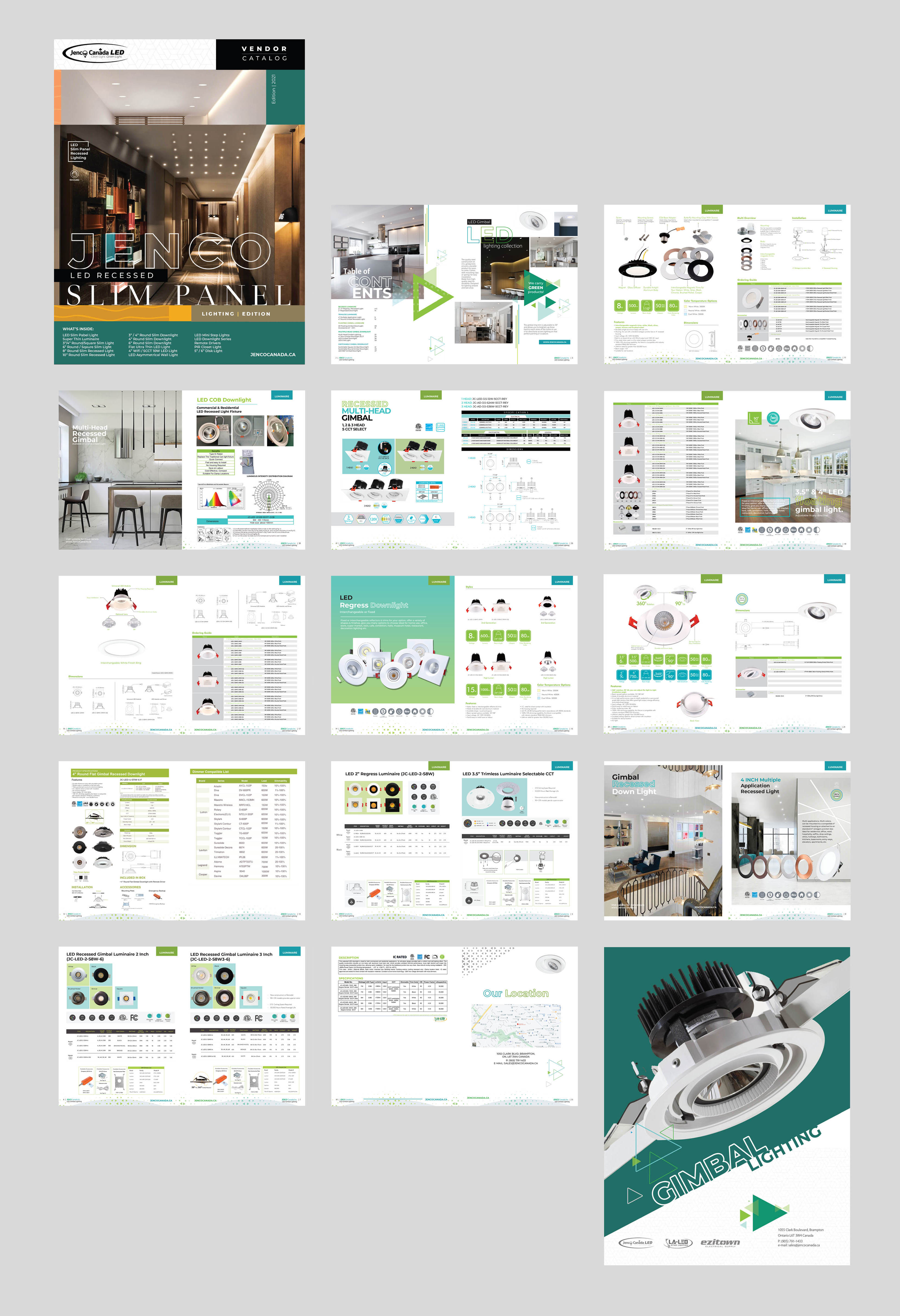
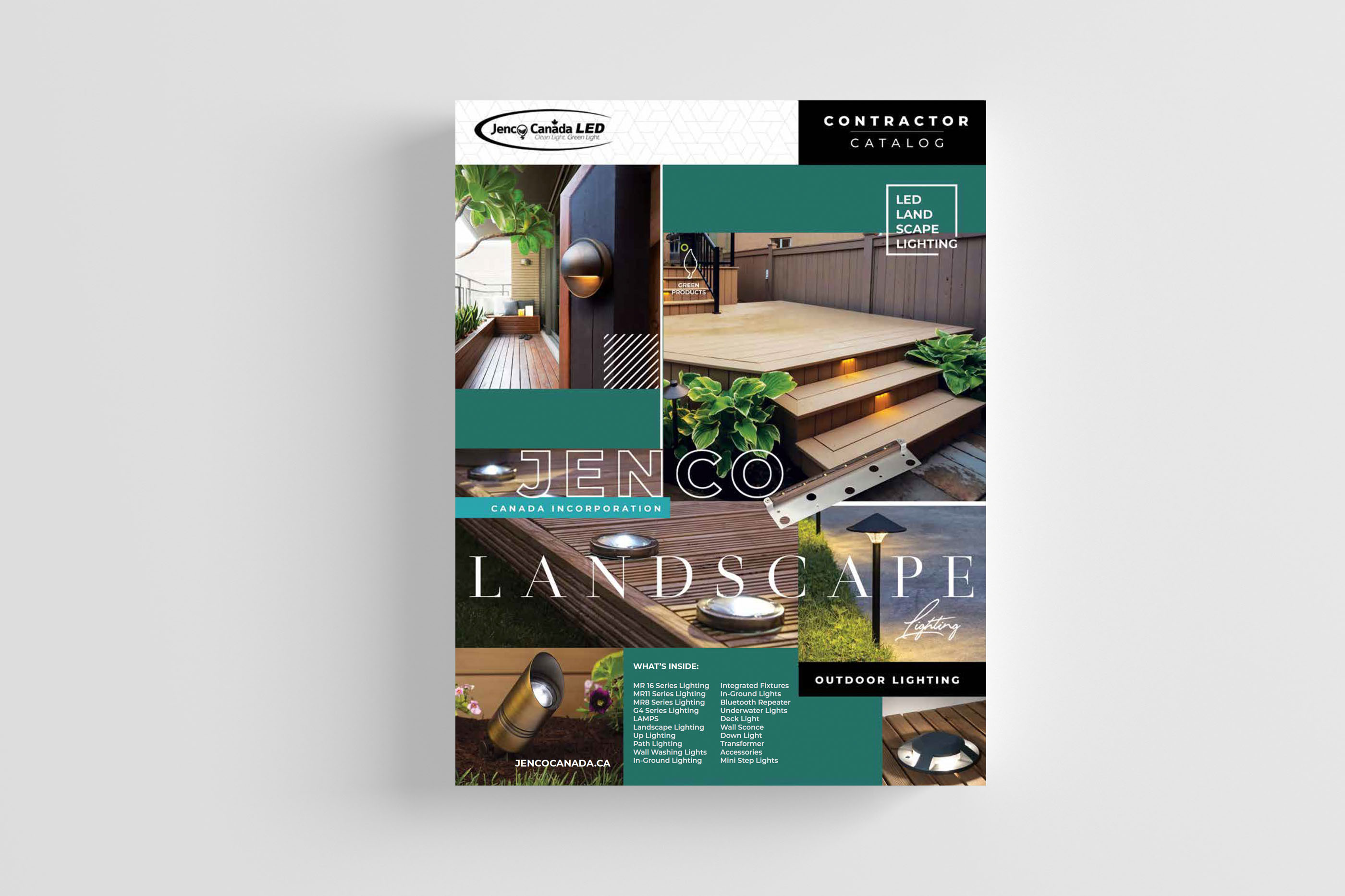
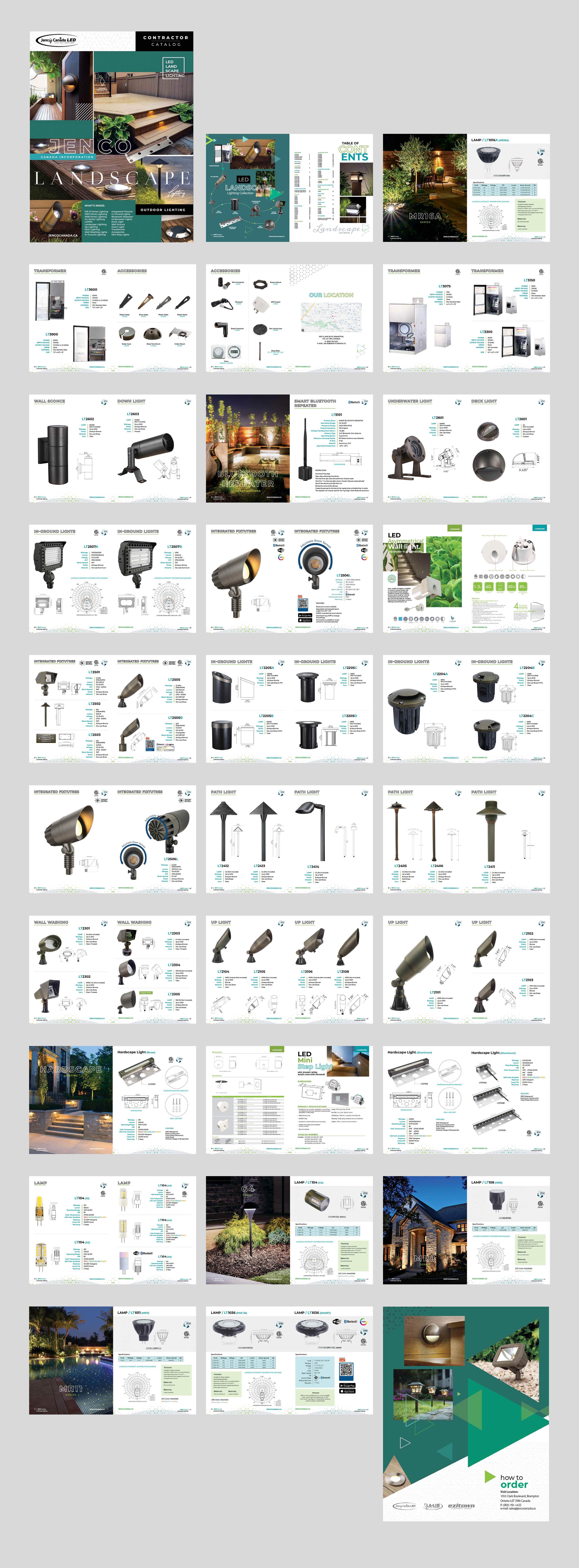
The product catalogue was designed with a focus on clarity, visual hierarchy, and usability to help customers easily browse technical specifications and key product details. Each section features organized layouts, intuitive categorization, and consistent typography for a professional, print-ready and digital-friendly presentation. High-resolution imagery and iconography were integrated to enhance product recognition and readability. The result is a clean, modern catalogue that communicates complex data with elegance and precision, supporting both sales and customer decision-making.

Image 1
Image 1

Digital e-Brochure Conversion for Web Use

The printed product catalogue was seamlessly transformed into a digital e-brochure optimized for web and mobile platforms. Interactive navigation, embedded links, and responsive layouts were introduced to make browsing faster and more engaging online. The digital version maintains the same premium visual identity while enhancing accessibility and shareability. This conversion allowed the brand to present detailed product information in a sleek, modern, and easily distributable format suited for online audiences.

Image 1
Image 1

Creative Content Design for Social Media Engagement

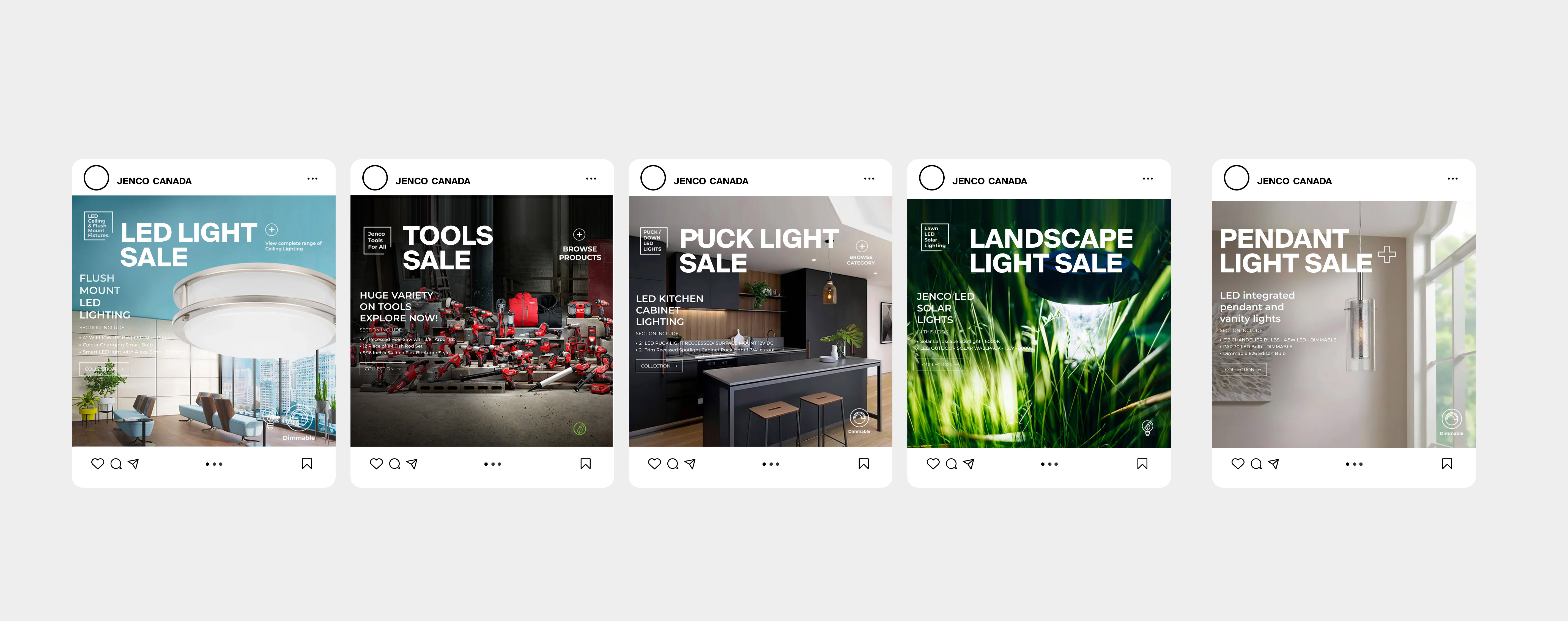
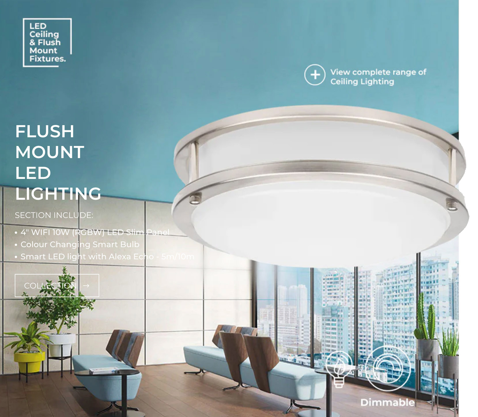
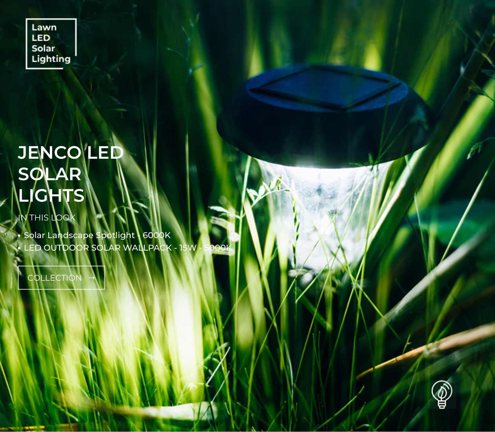
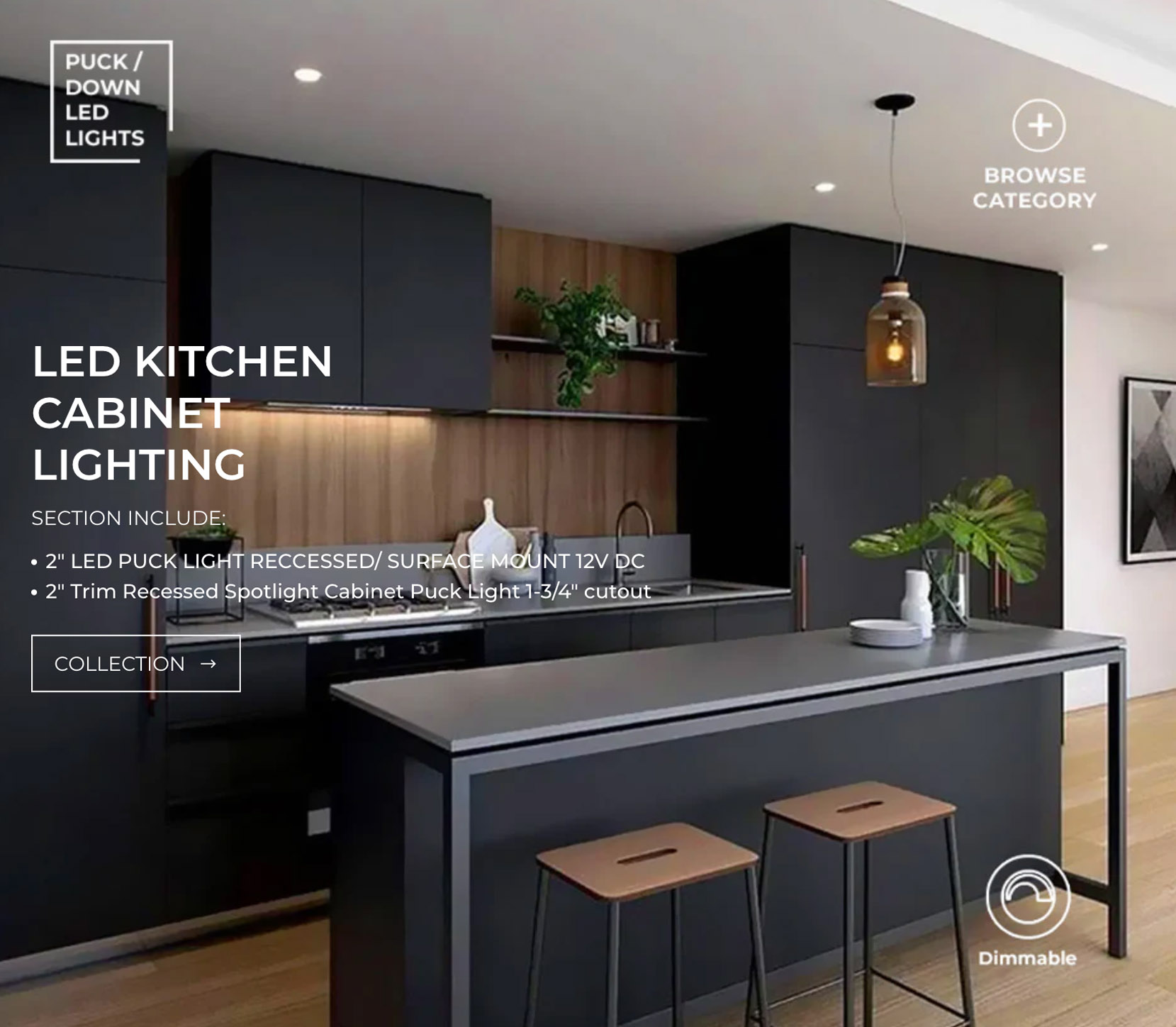
Social media creatives were designed to reflect the brand’s tone, personality, and visual identity while driving audience engagement across all major platforms. Each post combined strategic messaging with bold visuals to capture attention and encourage interaction. Campaigns were crafted around storytelling, product highlights, and seasonal themes to maintain a consistent online presence. The result is a cohesive set of digital assets that enhance brand visibility and strengthen audience connection.

Image 1
Image 1
Image 1
Image 1
Image 1
Image 1

Adaptive Promotional Headers for Mobile View

Custom promotional headers were designed specifically for mobile devices to ensure clarity and impact on smaller screens. Each header adapts dynamically to highlight offers and seasonal campaigns without disrupting the browsing flow. This approach enhances visibility, engagement, and overall mobile user experience.

Image 1

Navigation Headers for Mobile View

The staff uniform design process for Aroma Fine Fragrances USA was focused on creating a cohesive and professional look that aligns with the company's brand identity. We selected durable, high-quality fabrics to ensure comfort and longevity, suitable for both office and on-site work environments. The uniforms feature the Aroma Fine Fragrances USA logo prominently, reinforcing brand visibility and unity among the team. The design incorporates the company's signature colors, creating a consistent and recognizable appearance that reflects the company's values of strength, reliability, and precision. The result is a uniform that promotes team cohesion while maintaining a polished, professional image.

Image 1
Image 1
Looking for a branding partner?