Fork on York: Crafting a Modern Dining Experience

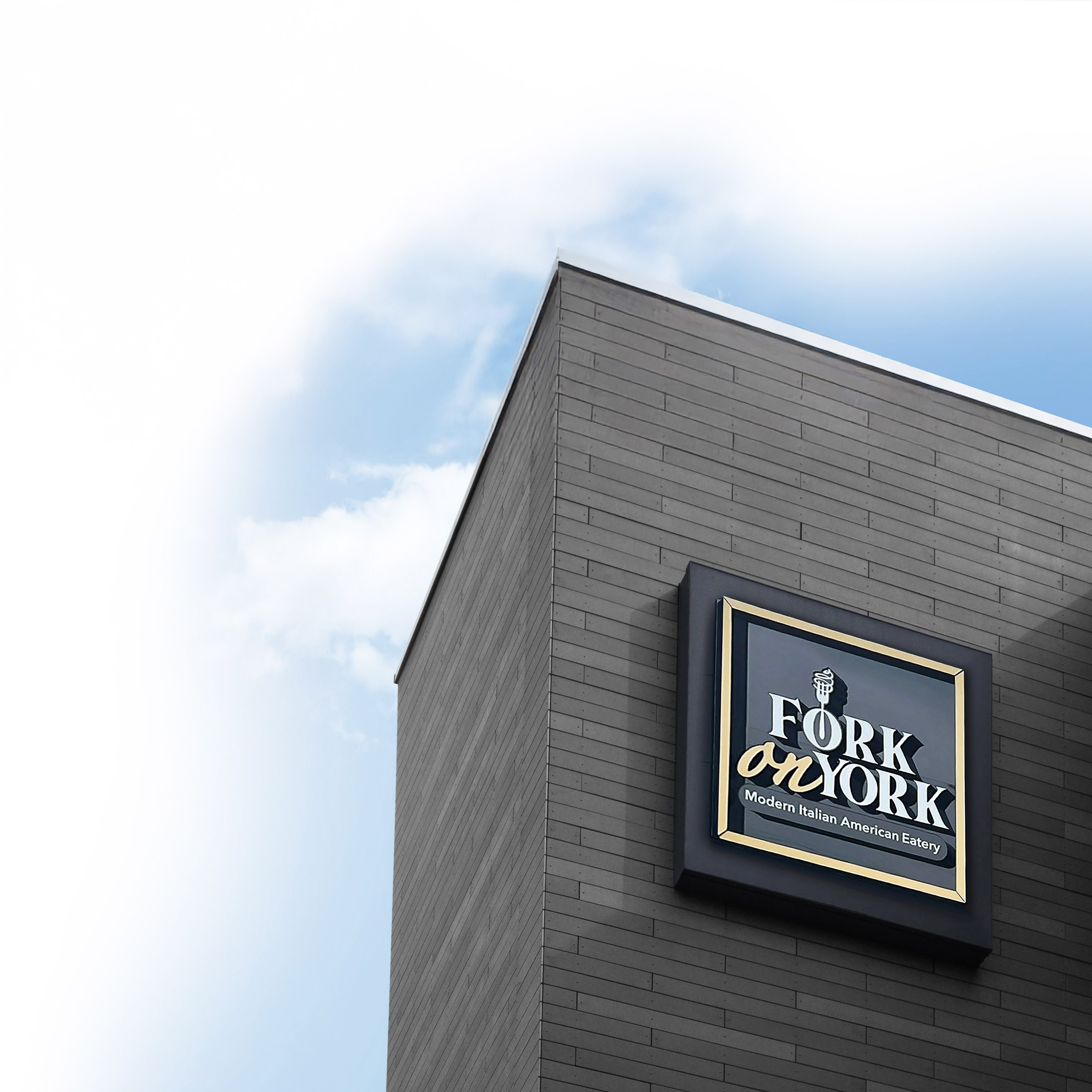
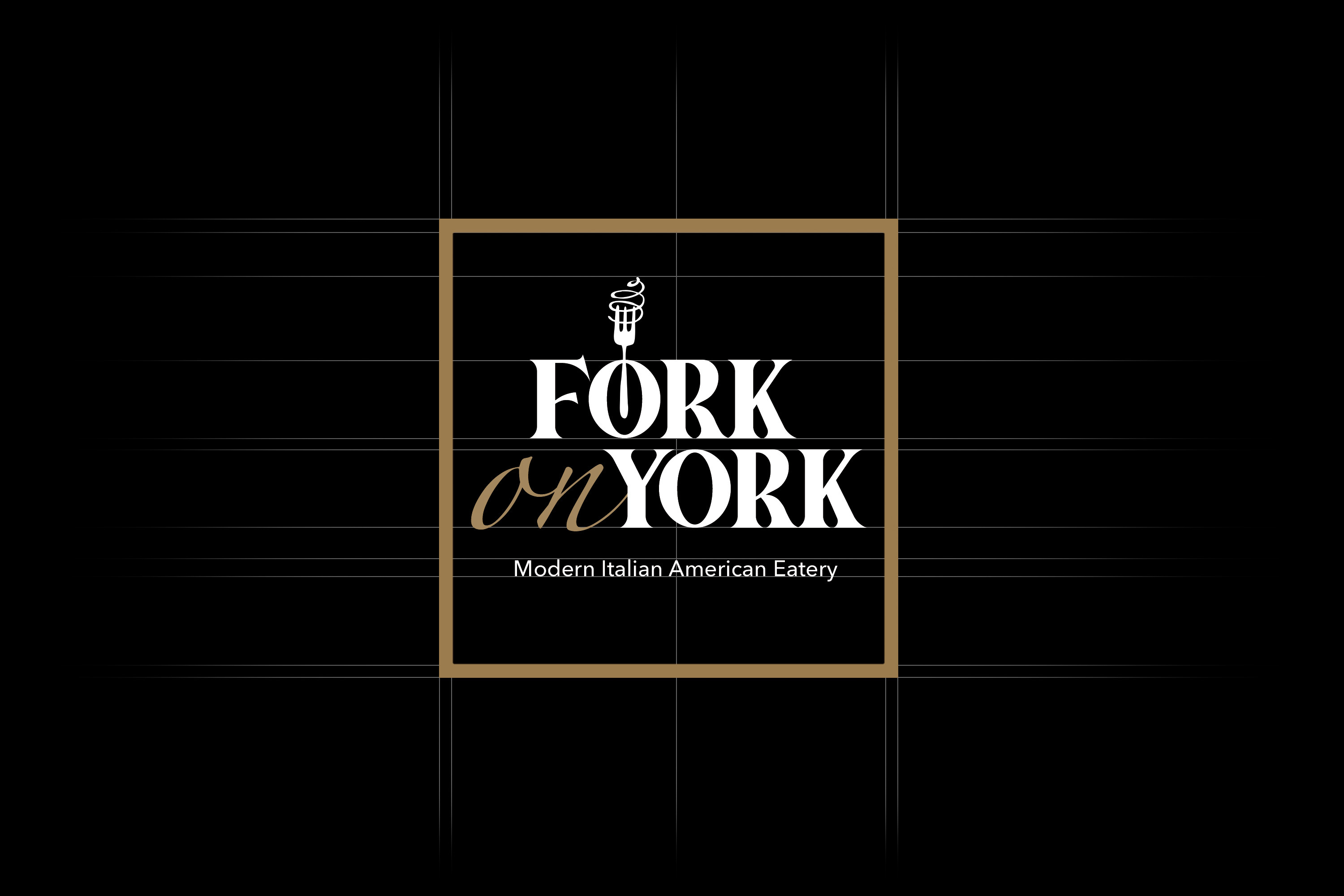
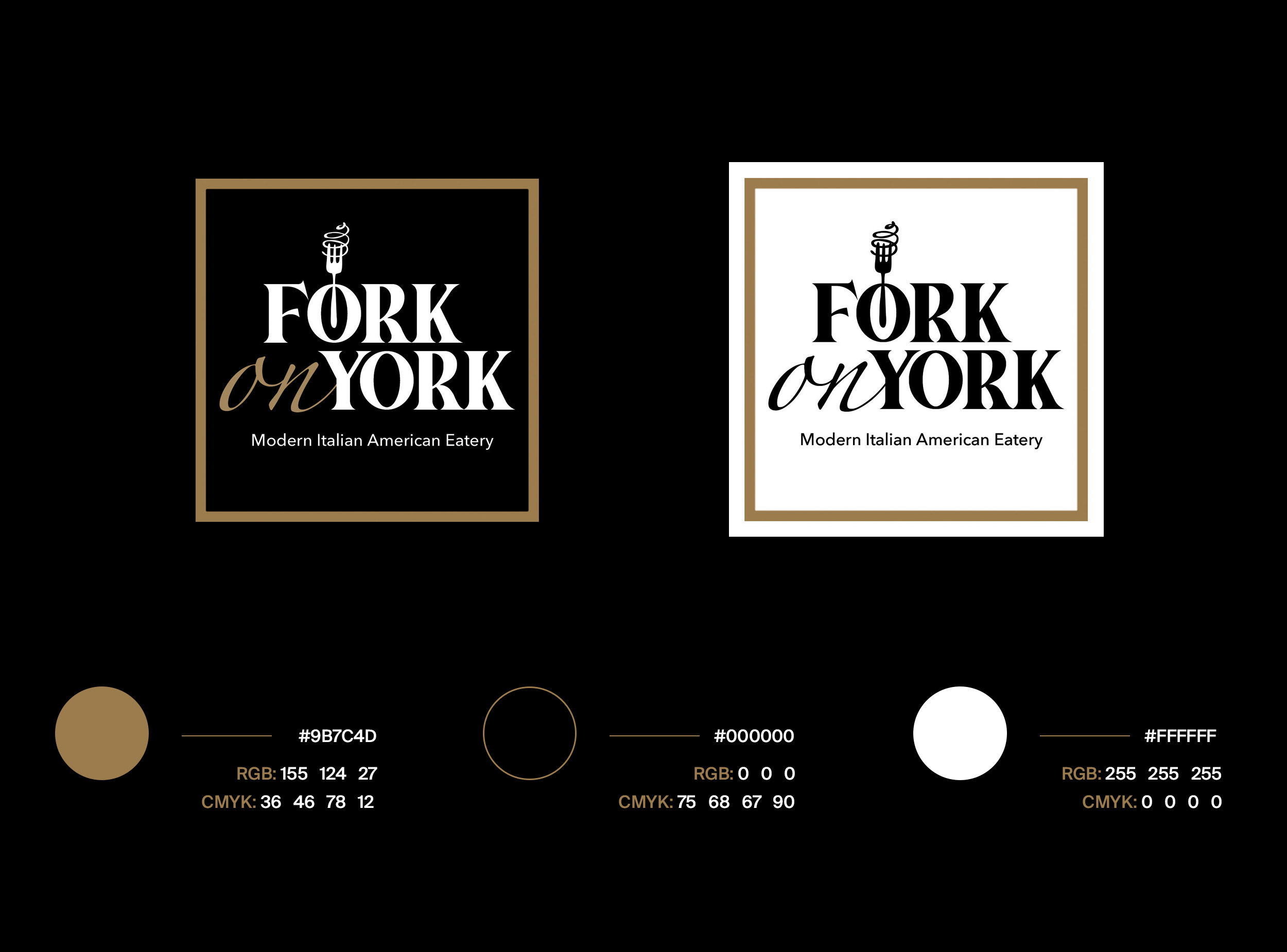
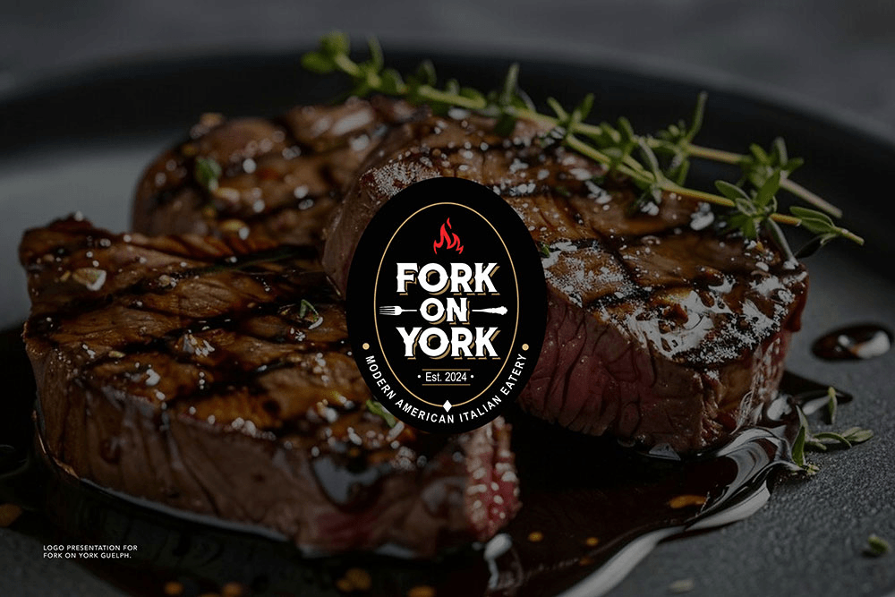
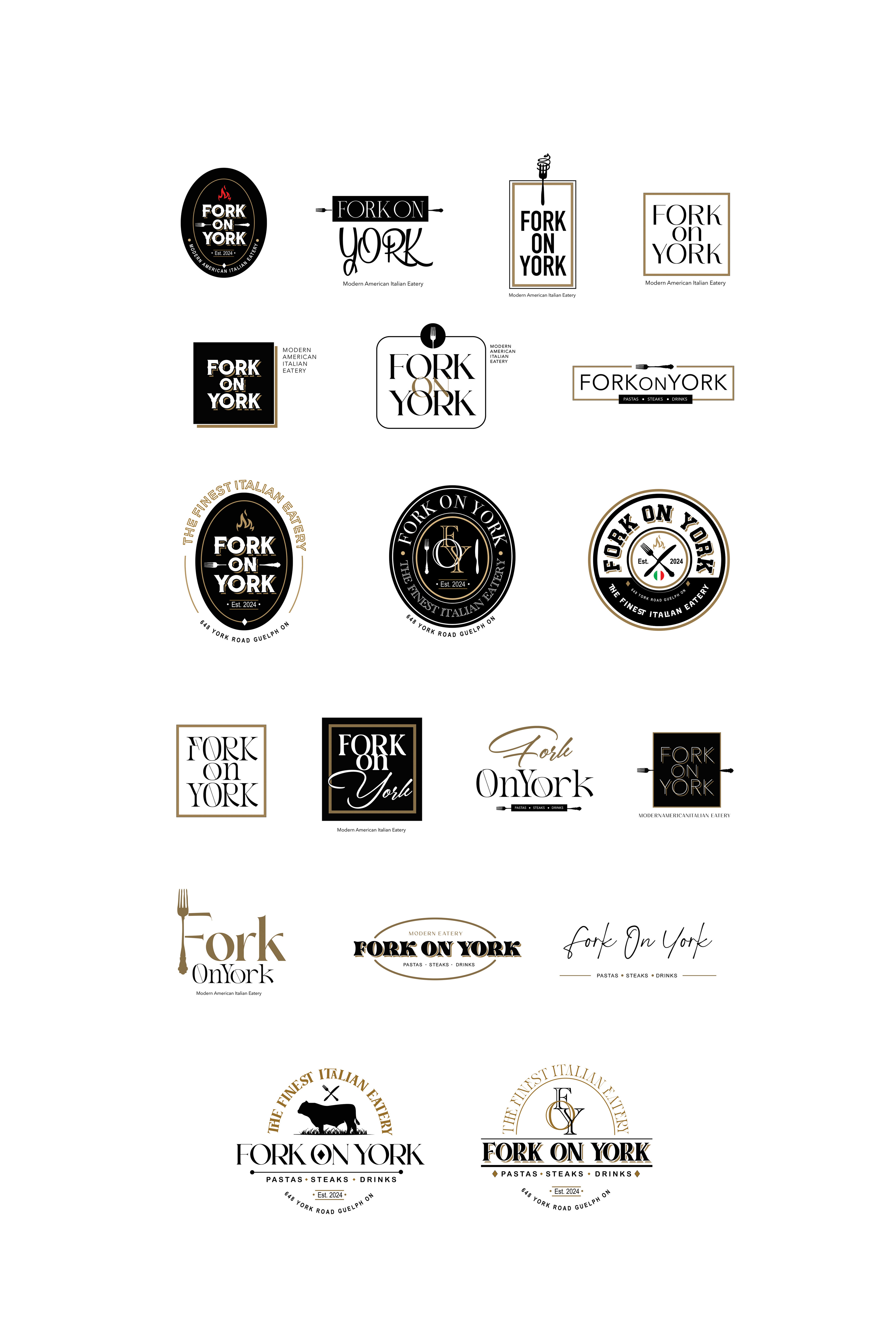
Fork on York, an Italian-American fine dining restaurant in Guelph, approached Dinx Studio to create a refined and inviting brand identity. The goal was to capture the warmth of hospitality while highlighting the restaurant’s elevated dining atmosphere and signature flavors. Through UX and UI research, we focused on creating a seamless digital journey that mirrored the restaurant’s sophistication. We refined the logo, introduced an earthy yet modern color palette, and designed a clean website with intuitive navigation for reservations and menu access.

The result is a timeless brand system that blends comfort with elegance. Fork on York’s visual and digital identity now reflects the charm and class of its culinary experience, both online and at the table.


Scope of project:

Brand Strategy – Brand Community Strategy – Branding and Identity Design – Identity System Design – Digital Marketing Assets Print Media – Menu Designs – Video Production and Image Editing for Menus

Image 1
Fork on York preview

Logo Design: The Symbol of Culinary Sophistication

The logo for Fork on York was designed to embody the restaurant’s contemporary yet comforting essence. Our goal was to create a mark that communicates refinement, trust, and a welcoming dining experience. Inspired by the interplay between Italian craftsmanship and American flair, the logo uses clean lines and subtle typography to convey modern elegance. Through careful UX/UI alignment, the logo extends seamlessly across digital and print touchpoints—from menus and signage to social media and the website interface. The result is a cohesive emblem that not only represents the brand visually but also emotionally connects with guests, reflecting the artistry and warmth that define Fork on York’s identity.

Image 2
Image 2

The Color Theory

The color palette was developed to evoke warmth, comfort, and culinary richness. Earthy beige tones blend with soft turquoise and muted coffee browns, creating an inviting sense of modern hospitality. These hues mirror the restaurant’s interior ambiance—where natural textures, warm lighting, and fine detailing come together in harmony. From a digital standpoint, the palette enhances legibility and emotional tone across the website and social platforms. The combination of grounded neutrals with subtle accents establishes a balance of trust, sophistication, and appetite appeal—perfectly aligning with Fork on York’s refined dining experience.


Logo Design Options Created

During the initial creative phase, multiple logo options were explored to capture the essence of Fork on York’s personality. Each concept balanced modernity with approachability—ranging from sleek wordmarks emphasizing fine-dine sophistication to emblem-style designs that reflected artisanal craftsmanship. Through detailed UX/UI research and client feedback, we refined the direction toward a minimalist typographic mark that pairs refined curves with geometric balance. The selected design stands out for its timeless appeal and adaptability. Whether applied on signage, menus, or digital platforms, the logo maintains clarity, elegance, and instant recognition—making it a true reflection of Fork on York’s elevated yet welcoming atmosphere.

Image 2 Image 2

Website Header Designs and Animation

The website opens with an immersive hero that sets the tone for refined dining. We designed adaptive headers that switch from a transparent overlay to a solid background on scroll, improving contrast and readability without blocking photography. Motion is purposeful and subtle. A gentle parallax on food imagery, micro-fade transitions on headlines, and a refined fork icon accent animate on load to guide attention toward reservations and menu links.

Animation choices were driven by UX research and performance constraints. We used lightweight CSS keyframes and SVG motion for crisp rendering, reserving short MP4 or WebM loops for select seasonal banners. Assets are art-directed per breakpoint, preloaded responsibly, and lazy-loaded to prevent layout shifts. All motion respects user preferences with prefers-reduced-motion and time-to-interactive budgets under two seconds on 4G. The result is a header system that feels premium, loads fast, and converts, with clear calls to action that remain visible through a pinned, compact navigation on scroll.

Looking for a branding partner?